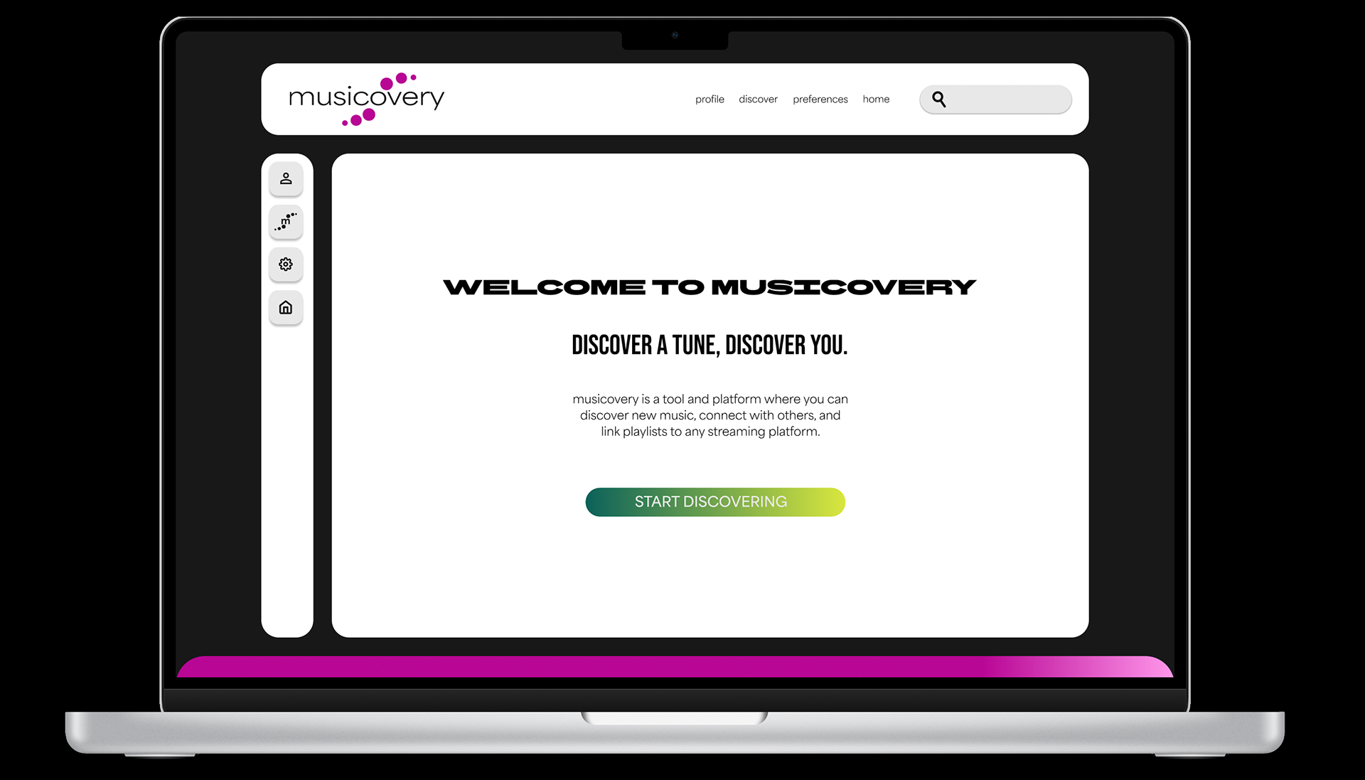
Objective
Translate your gained knowledge on Usability Heuristics and flows to analyze and redesign a Web 1.0 site of your choosing by using usability heuristics, affordances, signifiers, feedback, semantics, visual production, navigation, and strong visual application on a 12-column responsive grid to update into a clickable, modern redesign for today’s users.
Deliver a coherent visual design system and prototype that demonstrates better usability while honoring the spirit and content of the original site.
Concept + Research
I found musicovery.com through a wikipedia page that listed defunct websites. I was drawn to it because of its simple layout, filter elements, and colors.
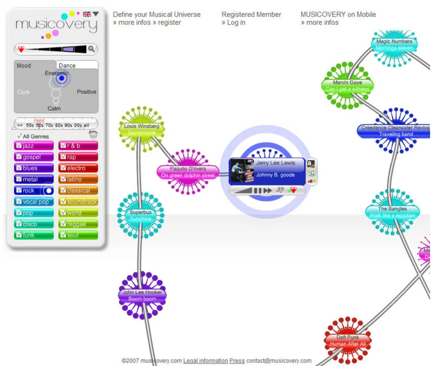
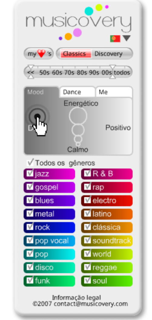
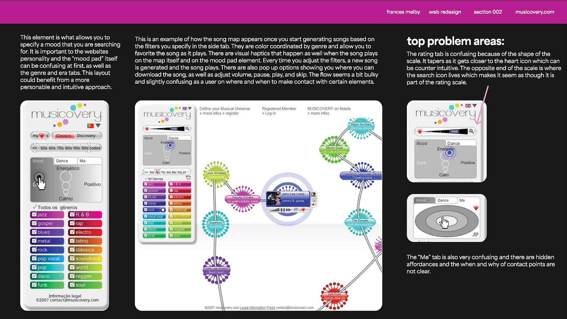
The website allowed the user to use a filter to generate songs based on genre, mood, and era. Each song generation would add to the map of songs and each color represented a different genre.
The website faced a few problem areas in its design and its usability including the rating tab, me tab, and general task flow. Understanding usability heuristics allowed me to see these problems with the website and start ideating solutions to the issues.
Process
Initial website analysis
Design Proposal
The current website design faces challenges in its filtering and favoriting functions. It also lacks flexibility and efficiency of use by only having one screen and no clear signifiers, making for a slower user interaction and more room for confusion.
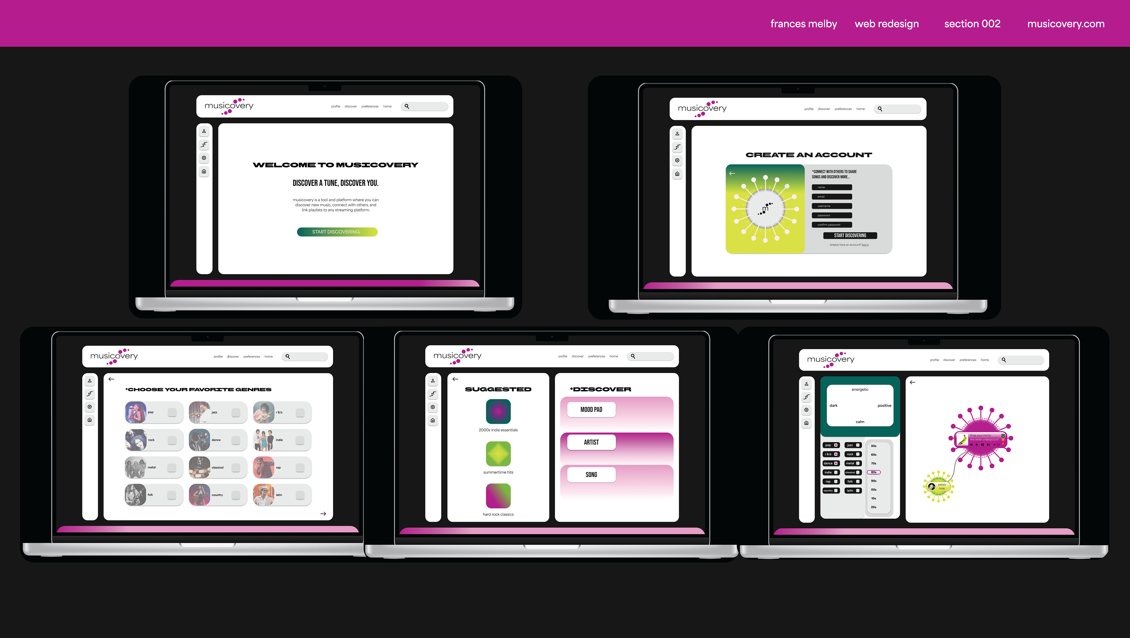
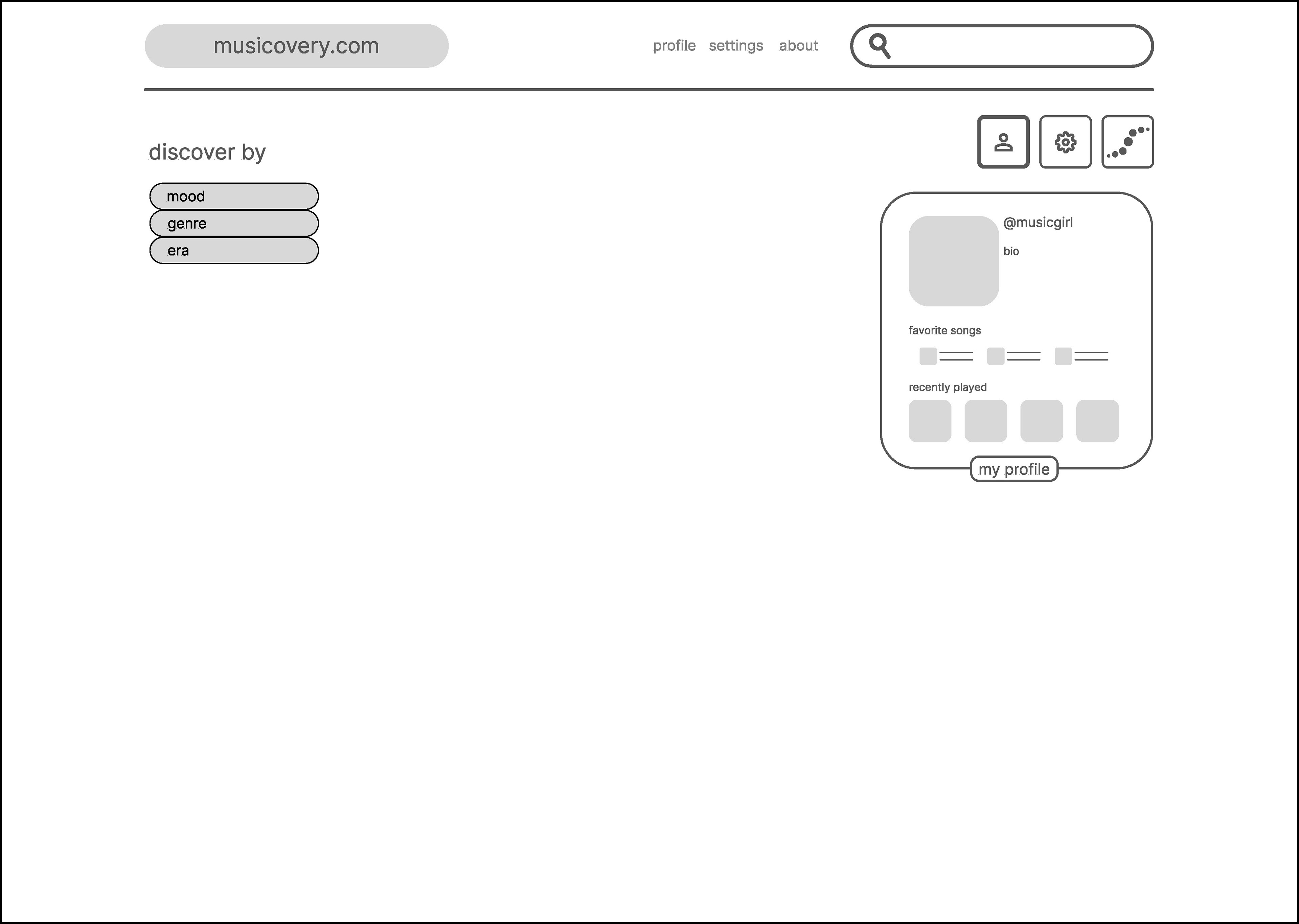
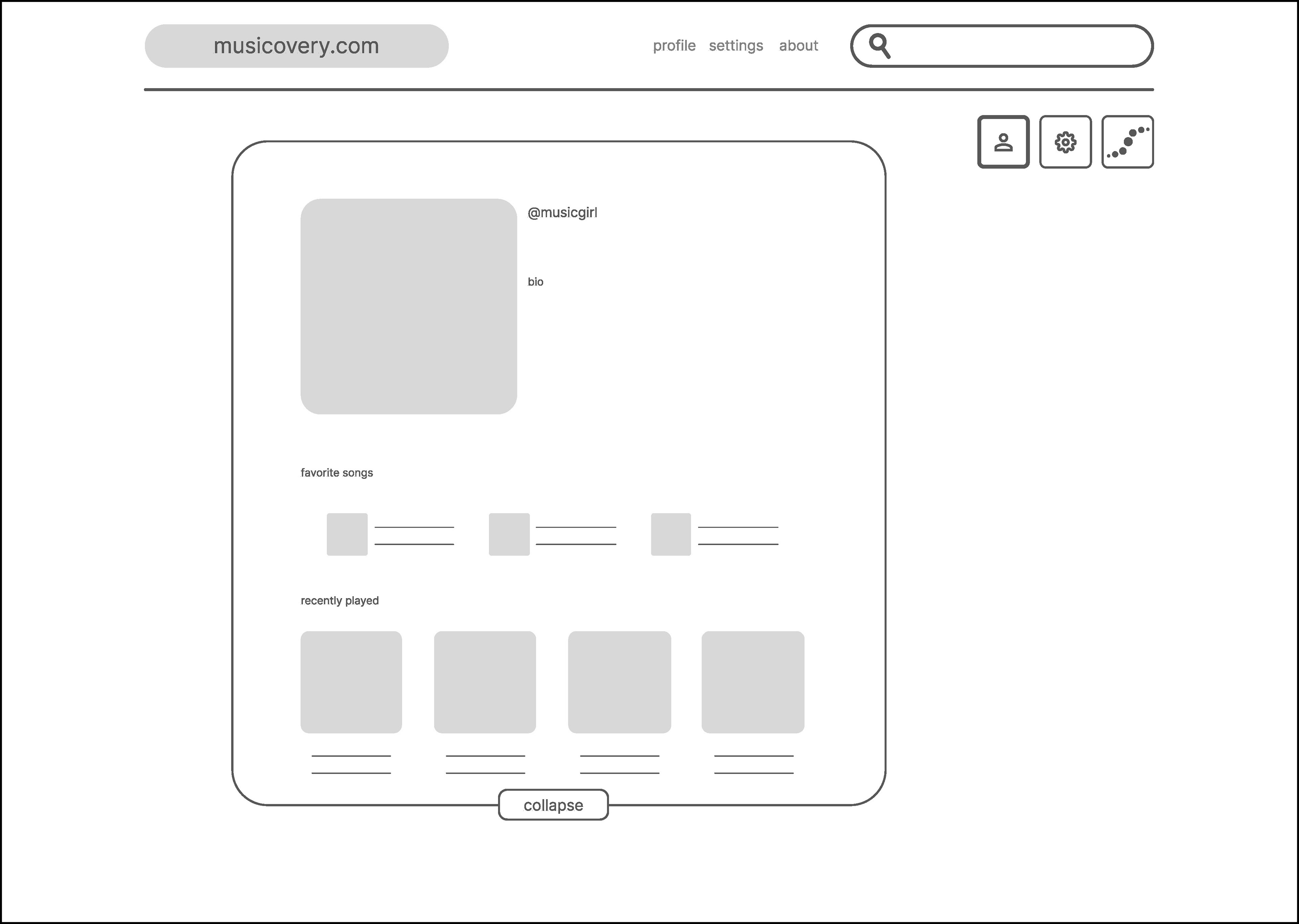
My goal is to address these user issues by amplifying signifiers in previously lacking areas. I aim to simplify the favorite scale and turn the “Me” tab into a profile page where you can access your favorite songs, playlists, and connect with friends. With more intuitive and successful signifiers, the user will have a more efficient, effective, and overall enjoyable experience.
User Personas
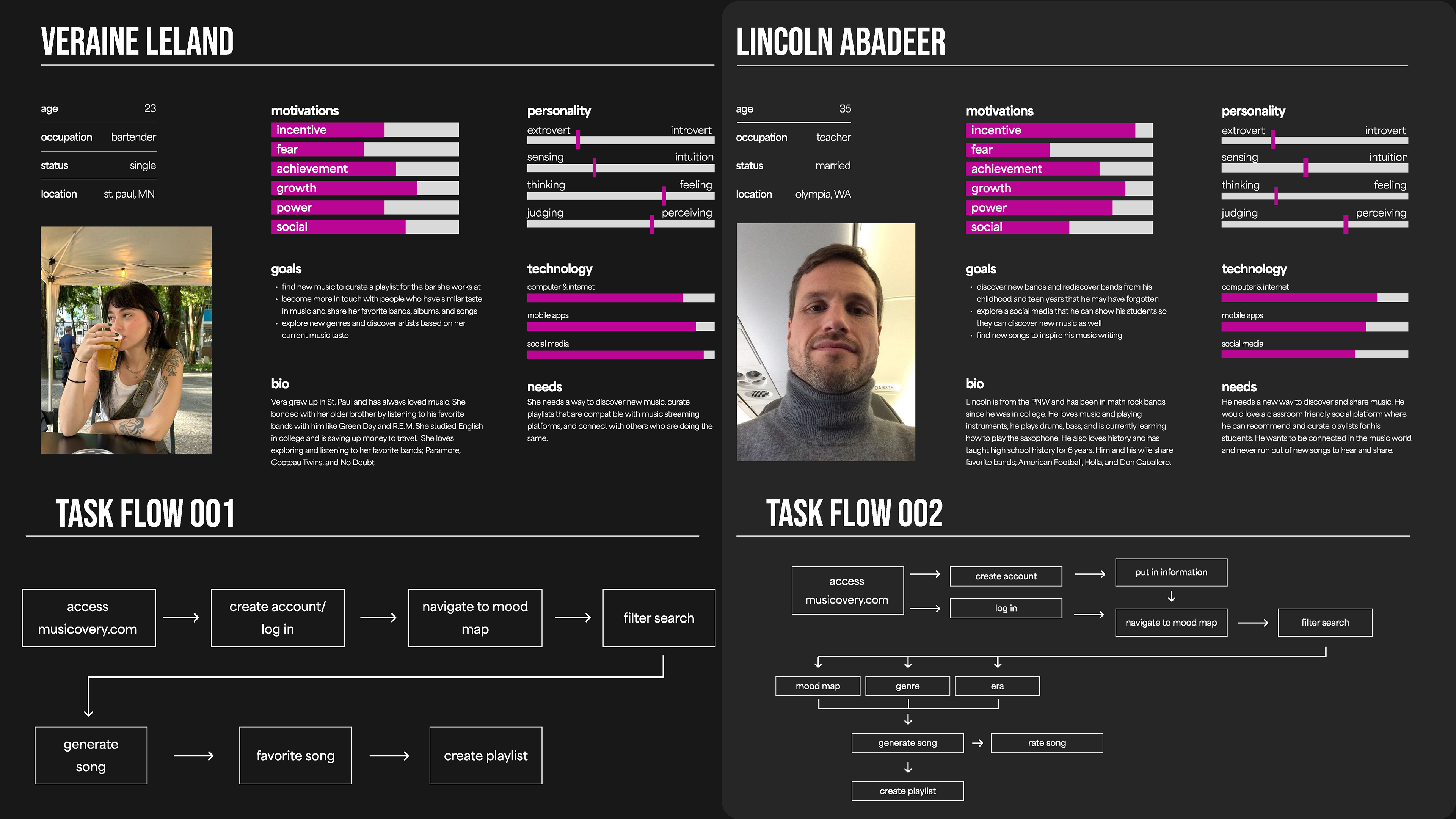
I created two personas of people who would use musicovery.com and why they need it. It goes over their personal information as well as their internet and social media proficiency. I also created two specific task flows based on their needs.
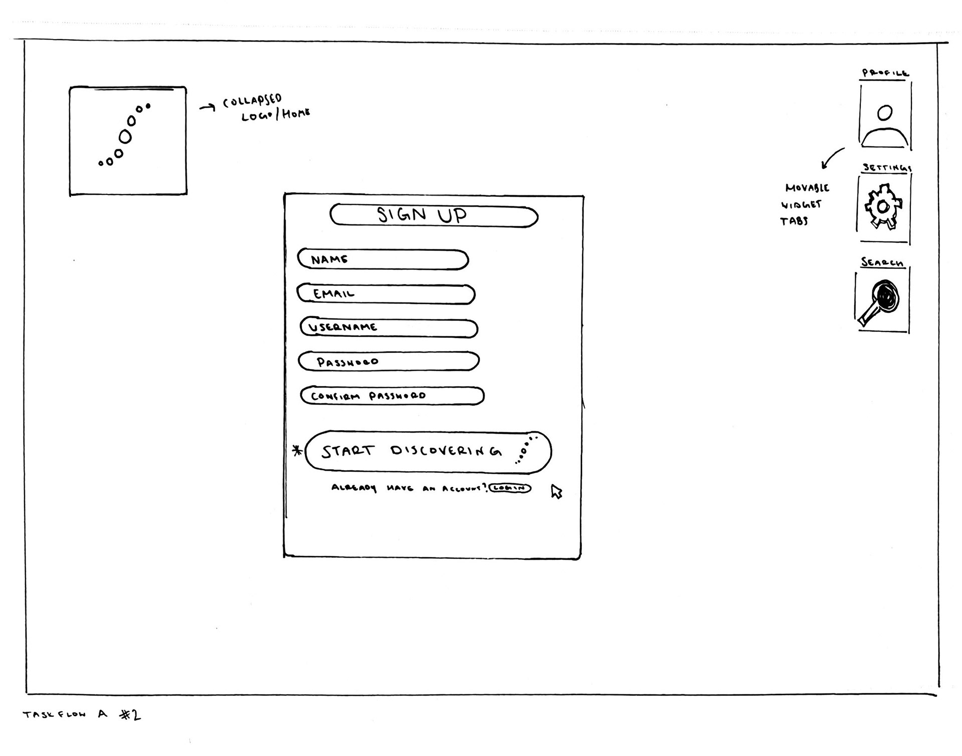
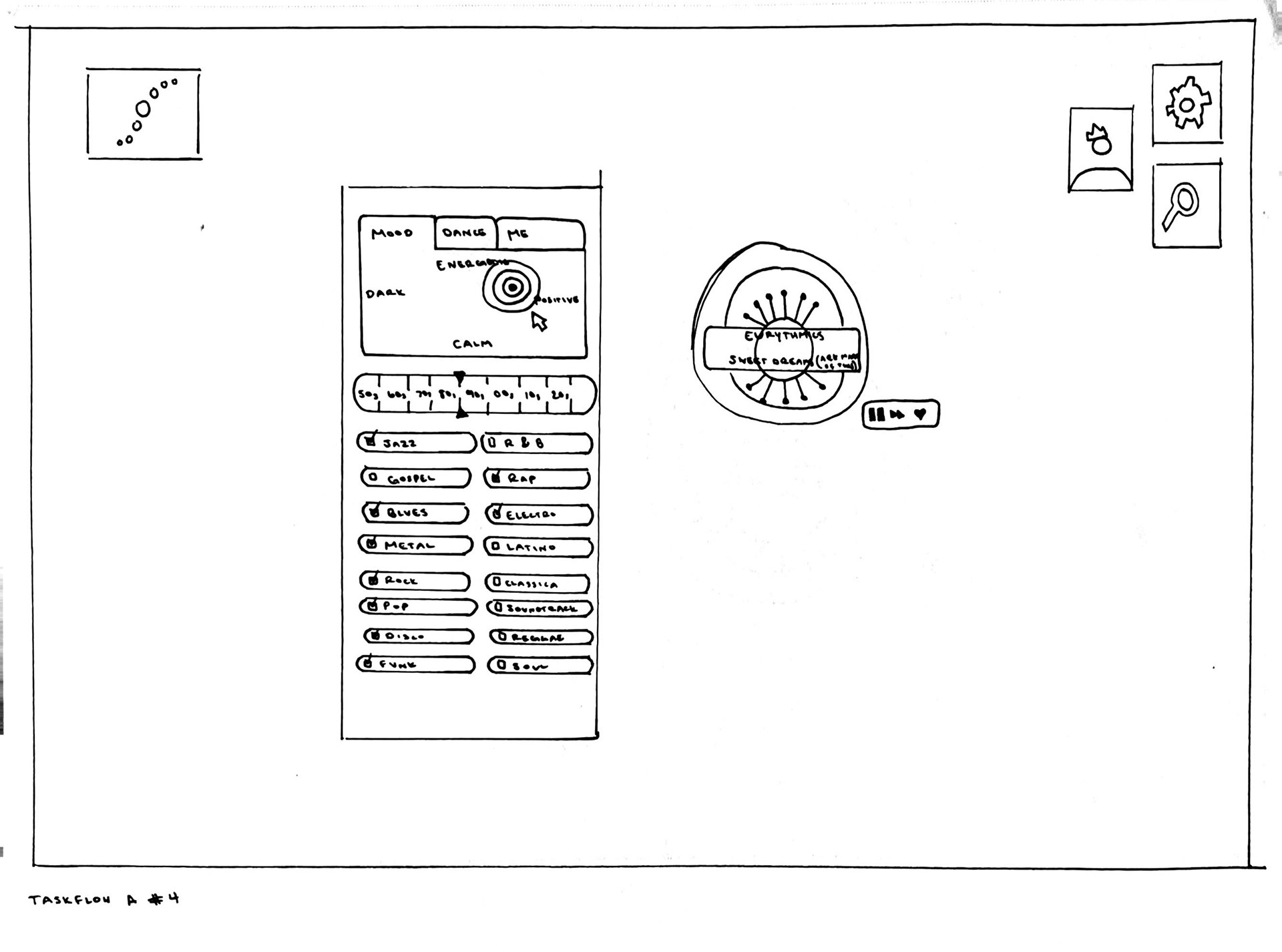
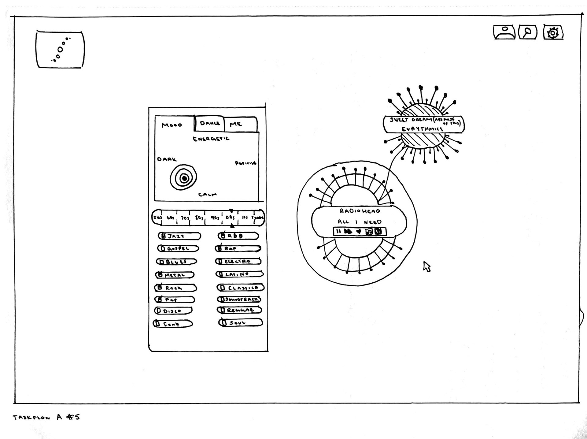
Initial Lo-fi Sketches + Task Flow
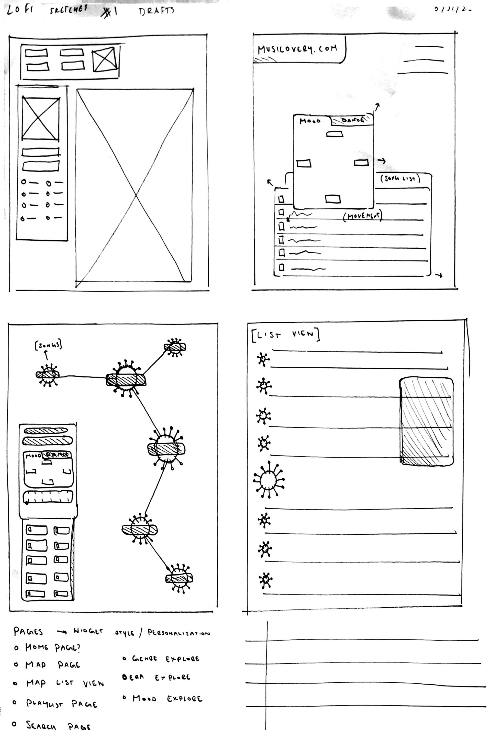
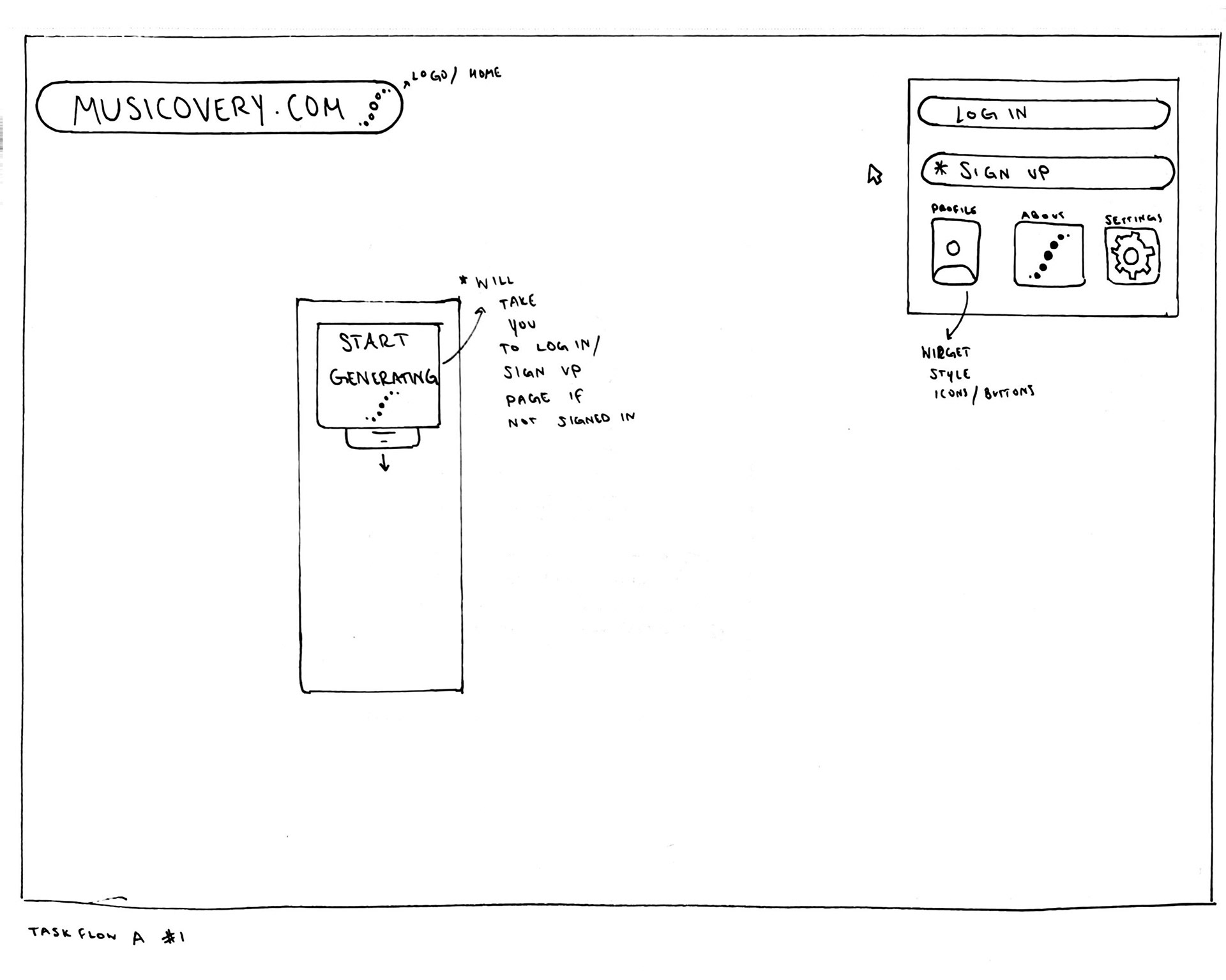
I started to sketch the task flow that the website would follow. The original website had only one main page, so I began to experiment with what other pages and task flows could be.
Mid Fidelity Wireframes
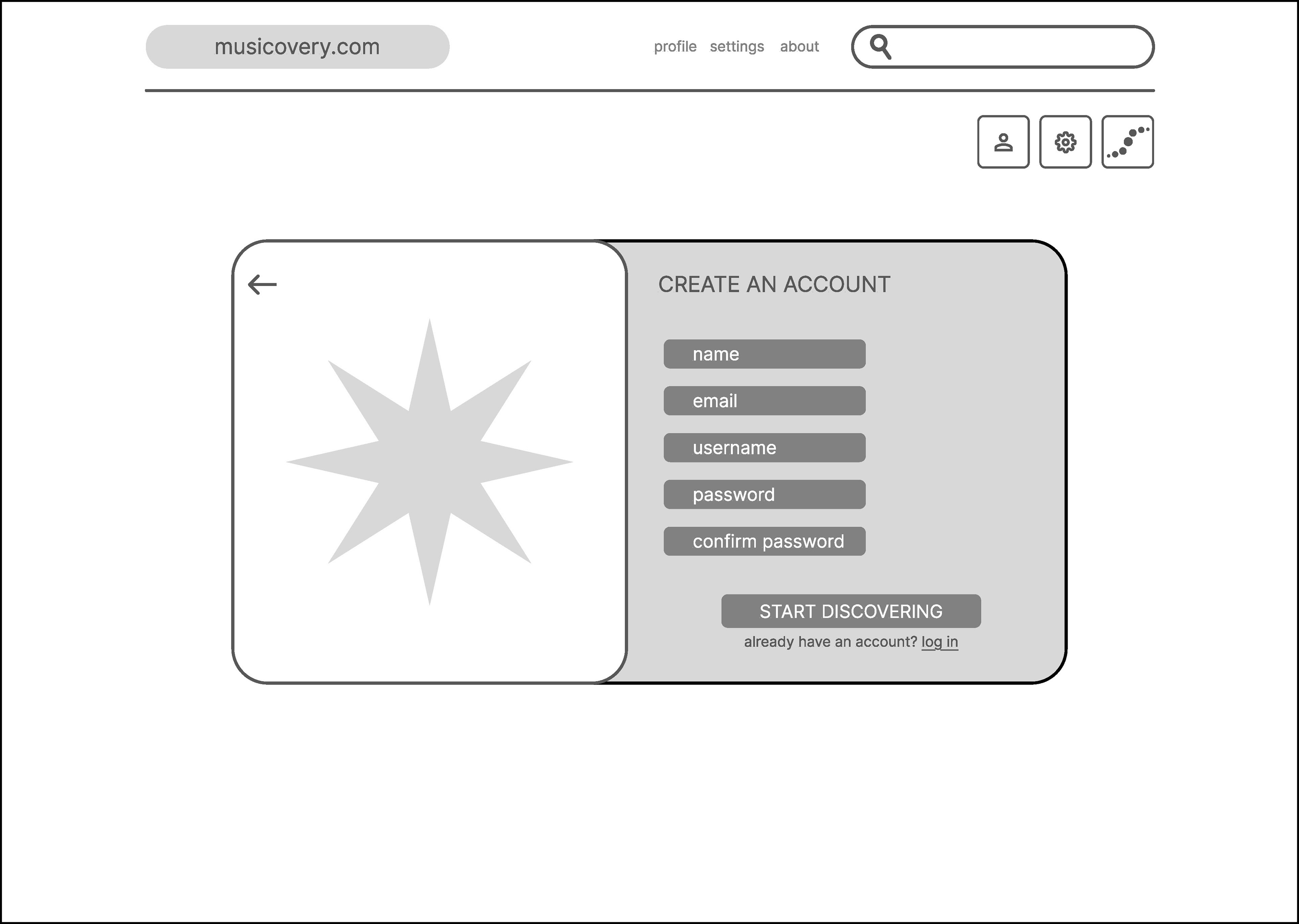
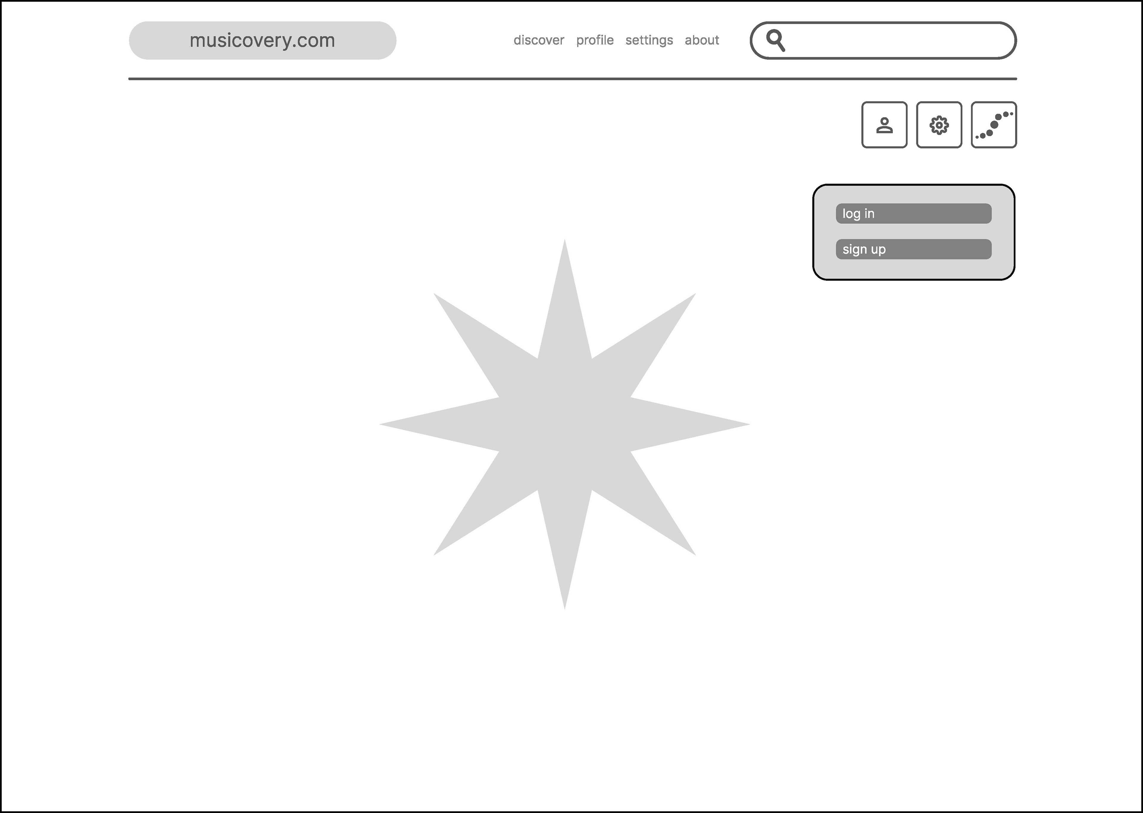
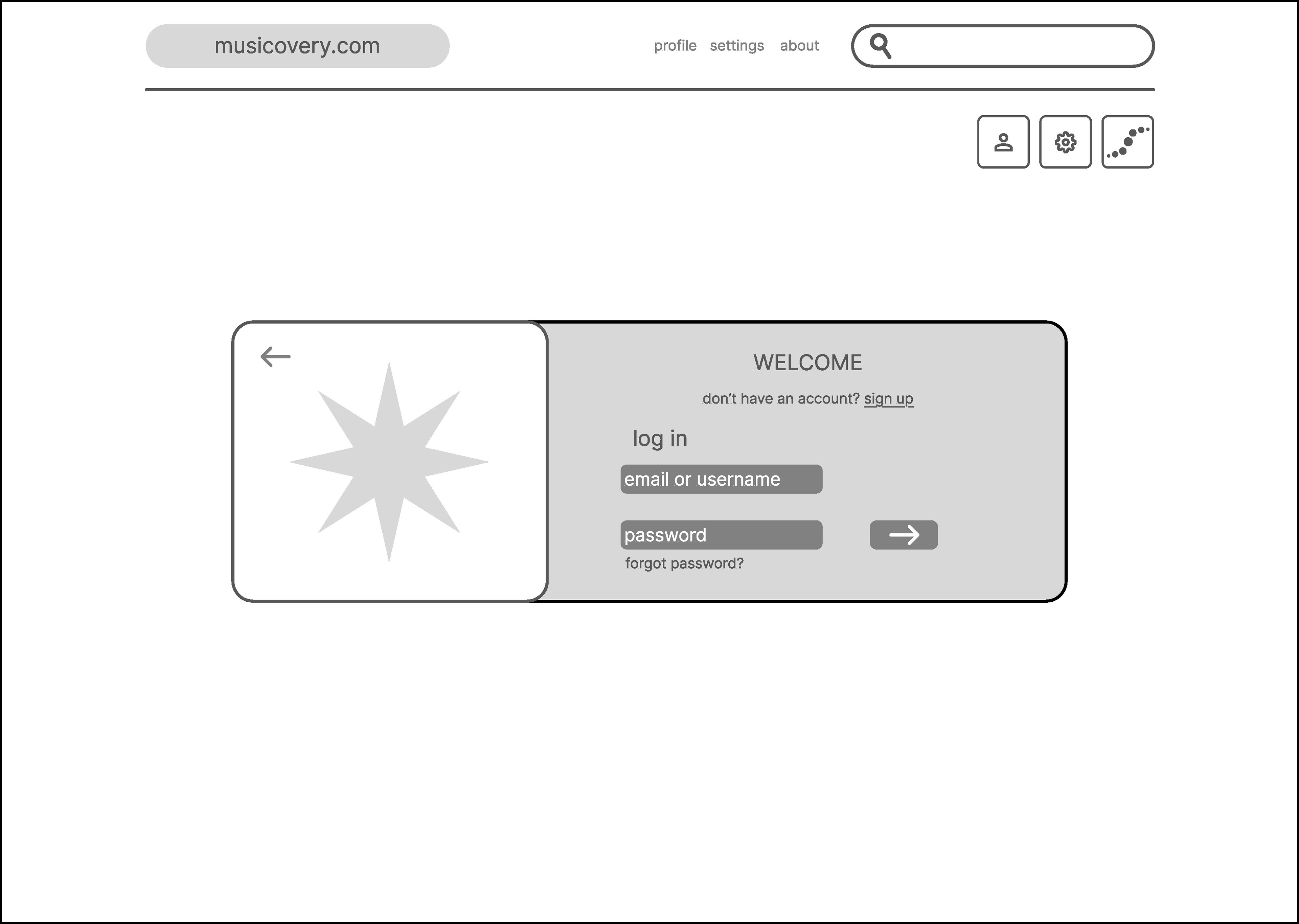
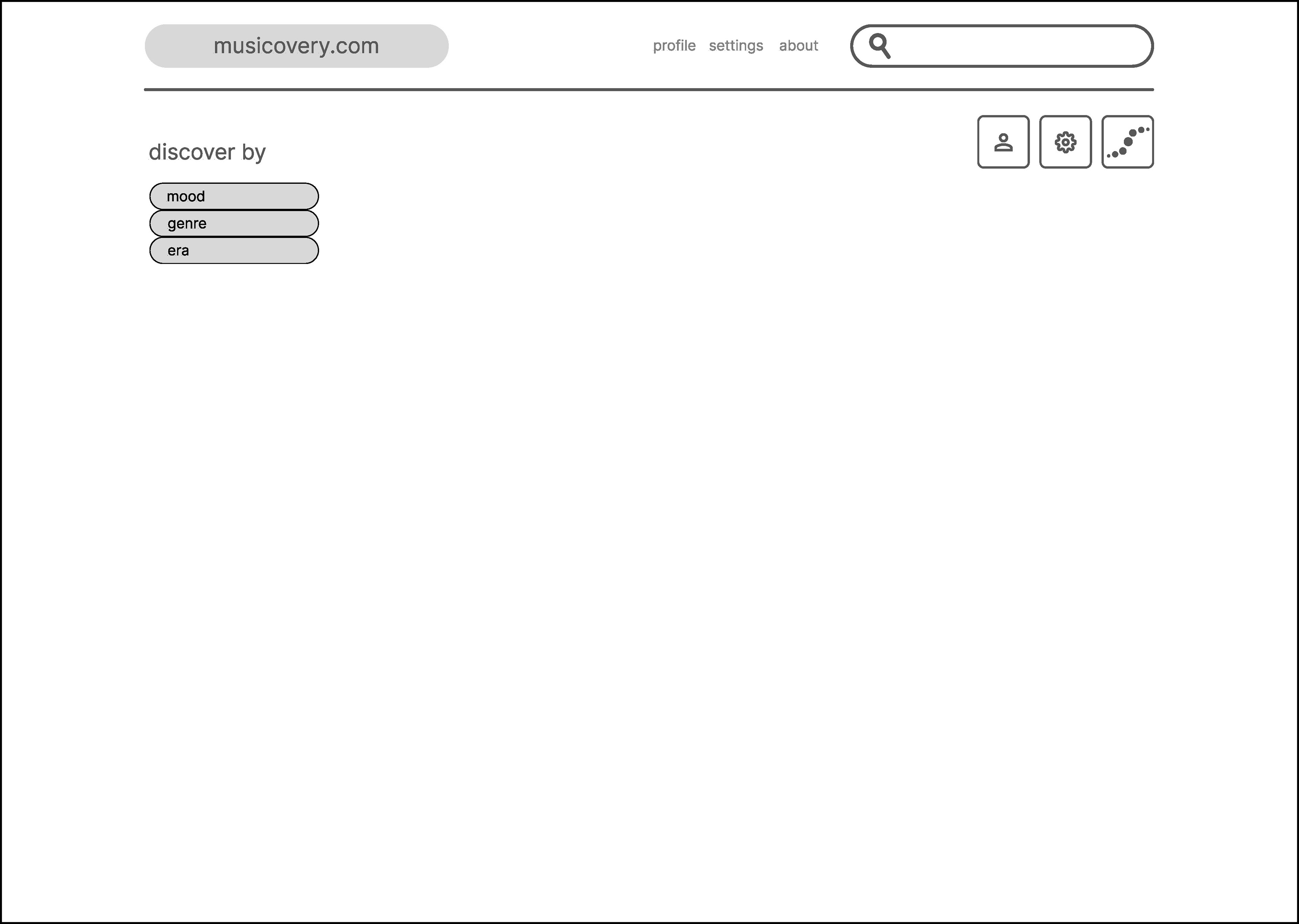
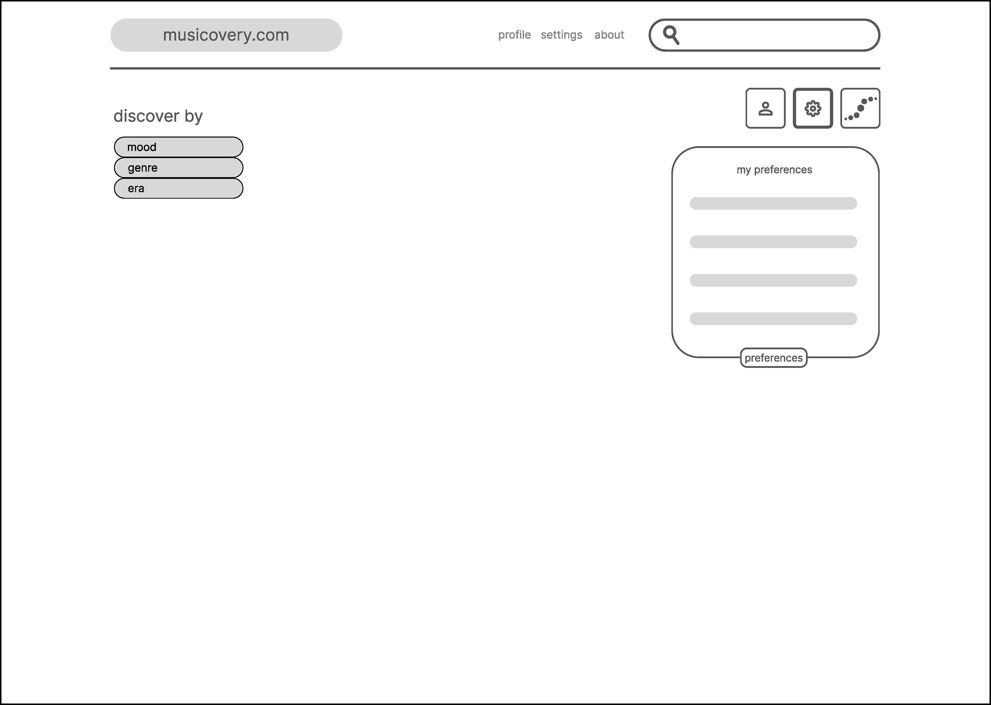
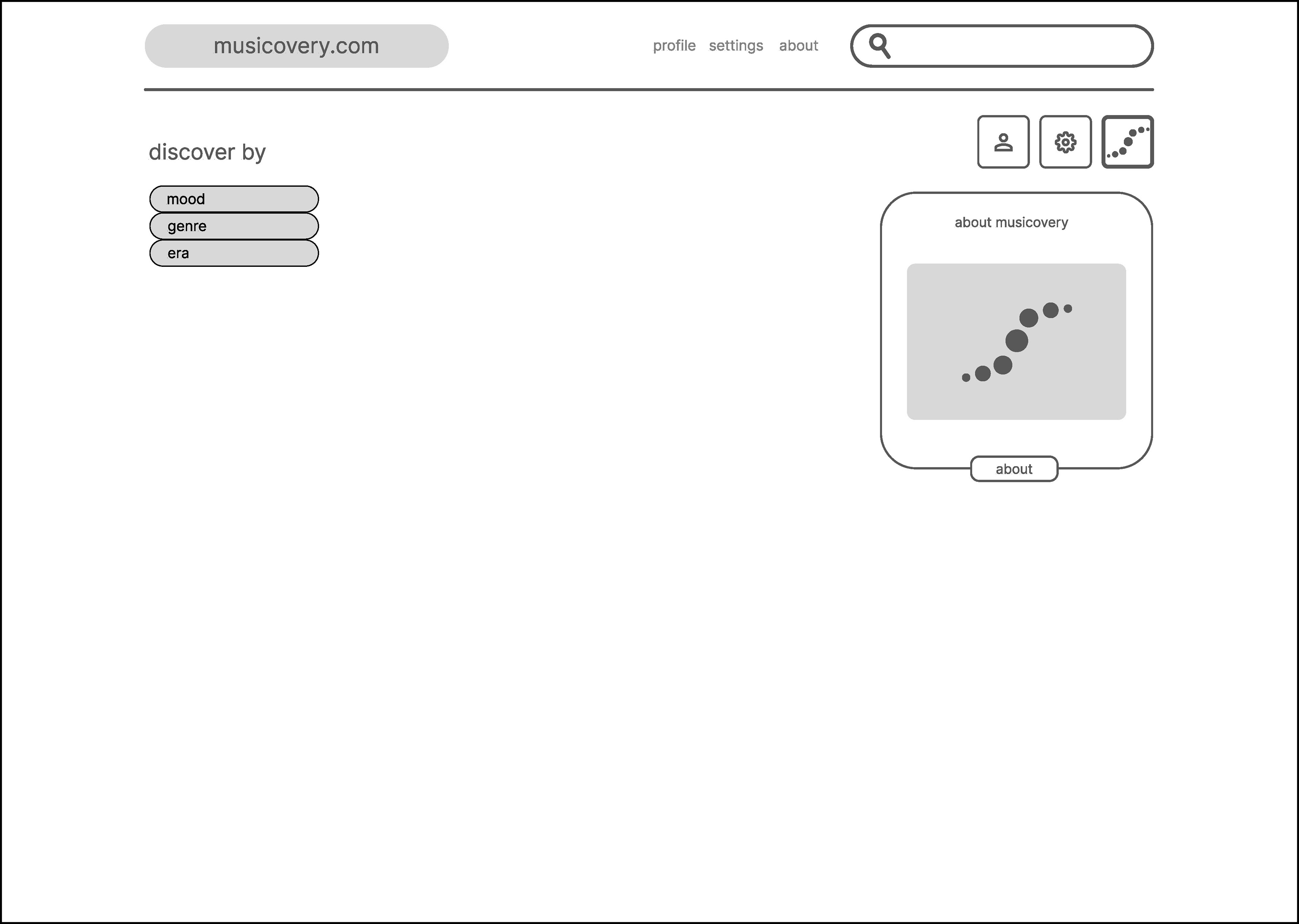
I started to wireframe my task flow sketches in Figma in order to start to test the usability and elements.
Mood Boards + Style Tiles
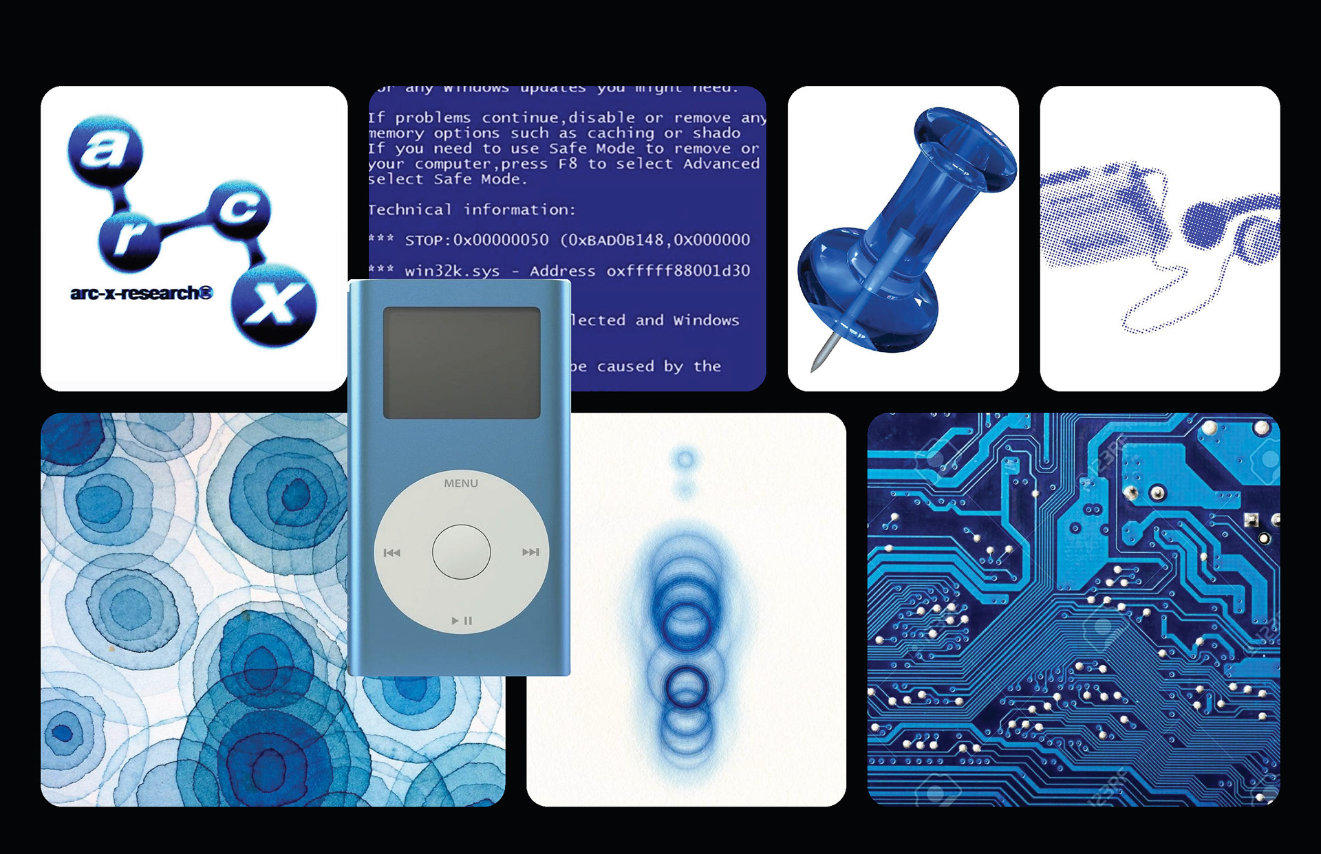
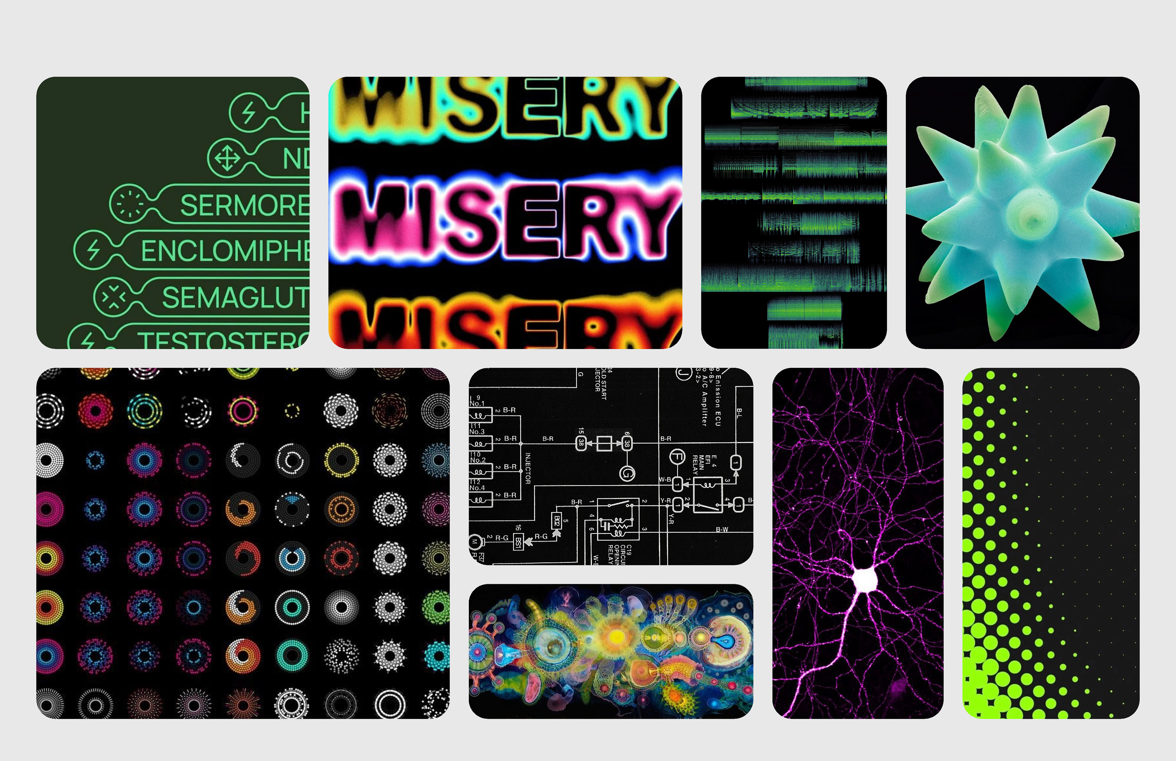
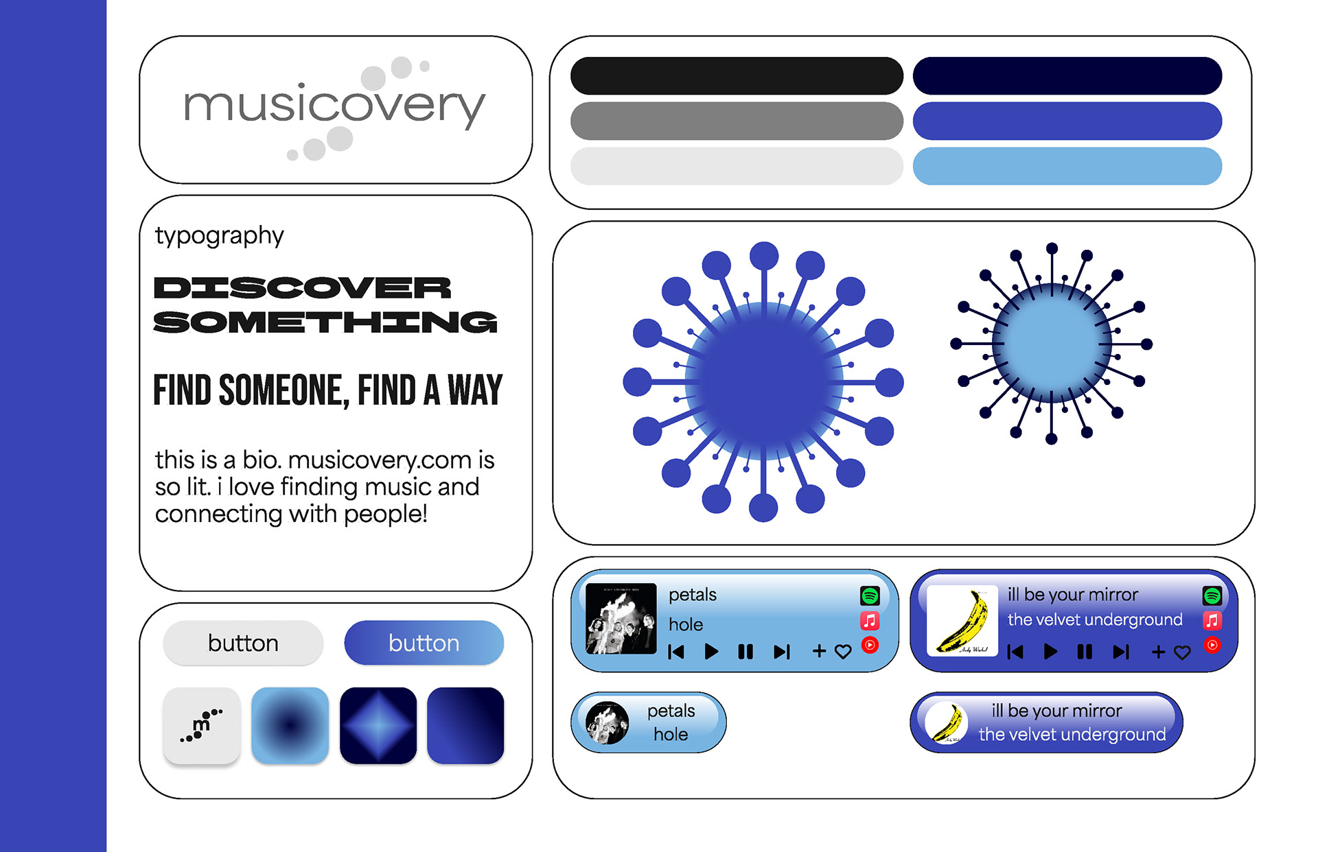
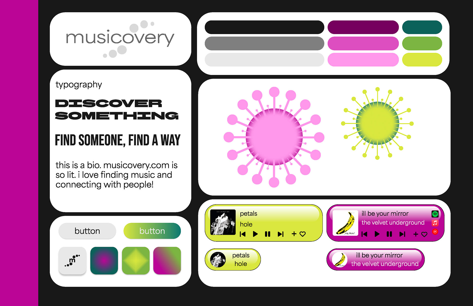
I wanted to tie in the original websites theme of this micro-organism shape as well as tie in some technological elements. The organic and metallic aspects compliment each other well. I also wanted to incorporate vibrant colors, similar to the original website, but with a more thought out and branded perspective.
Final Screens