Objective
Design a generative identity system that dynamically represents the attributes of a product, artifact, or service through coded visual variations. Combine visual research, computational experiments through procedural sketching, and applied design to create a flexible identity across multiple contexts.
Research
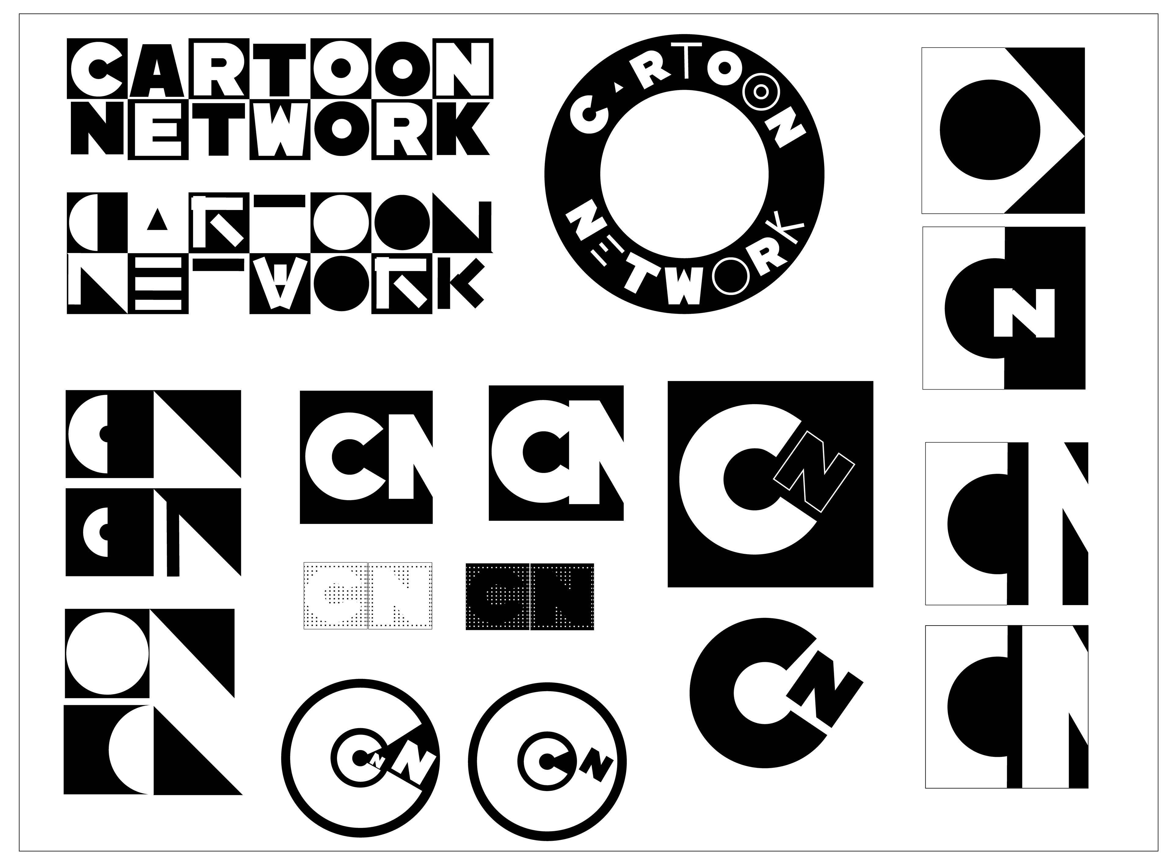
When picking the brand identity, I wanted to choose an iconic and also nostalgic identity that was easily recognizable. I wanted to make sure it had the simplicity and flexibility to be coded as well as applied to relevant contexts within its identity.
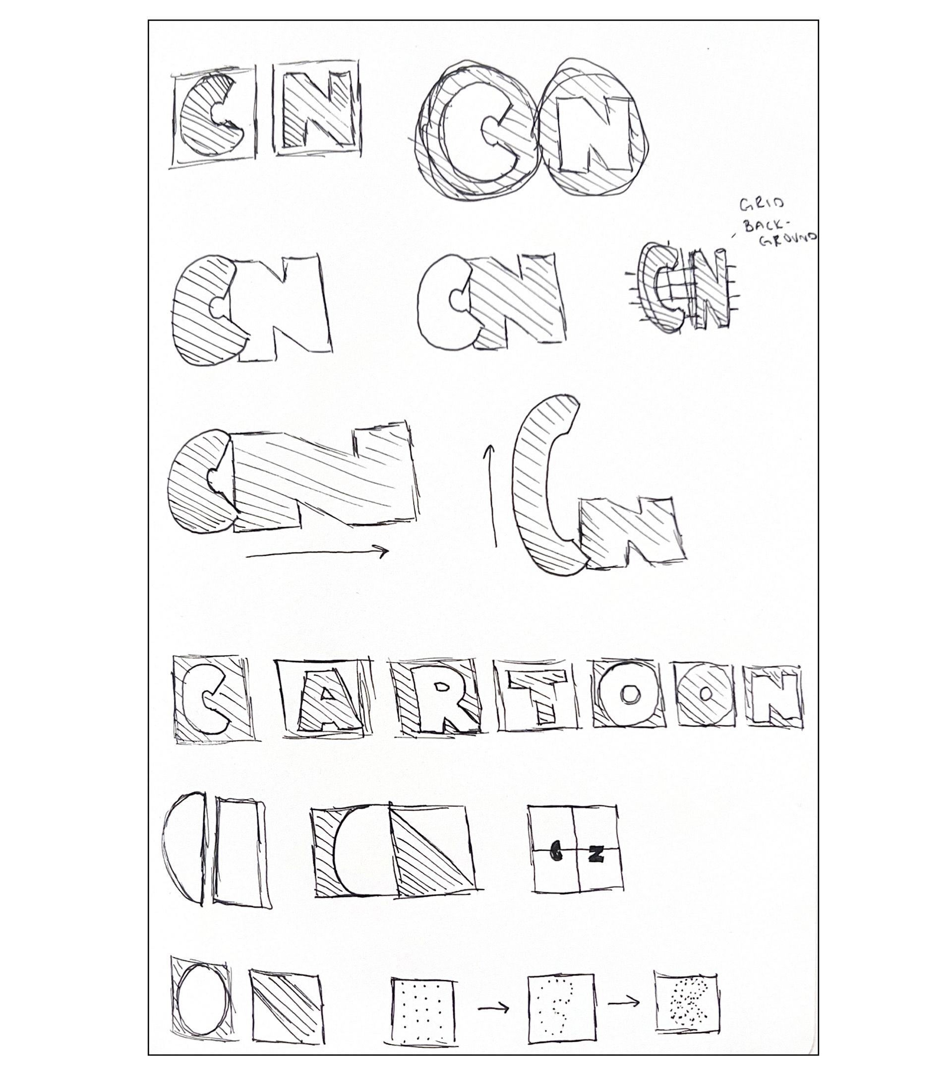
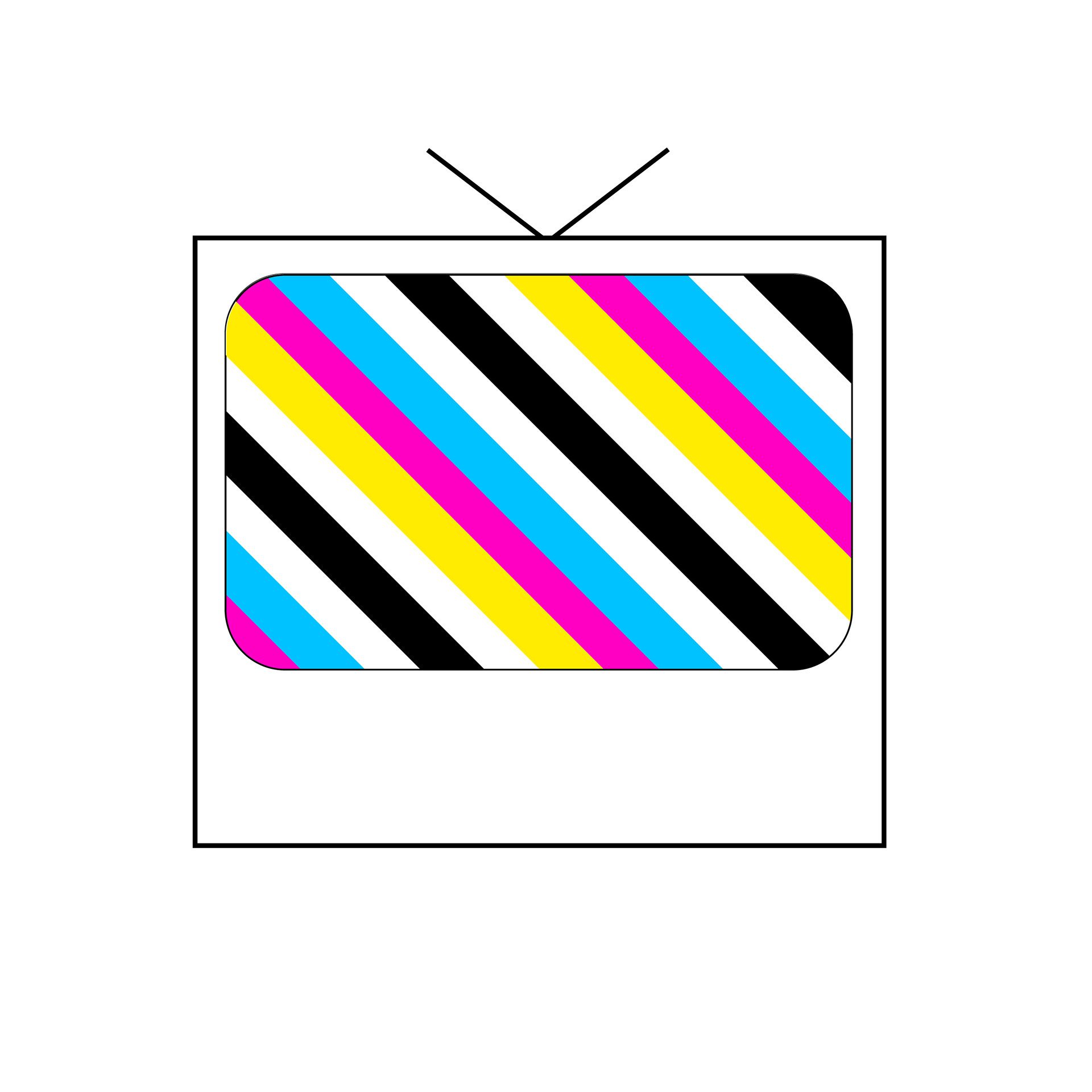
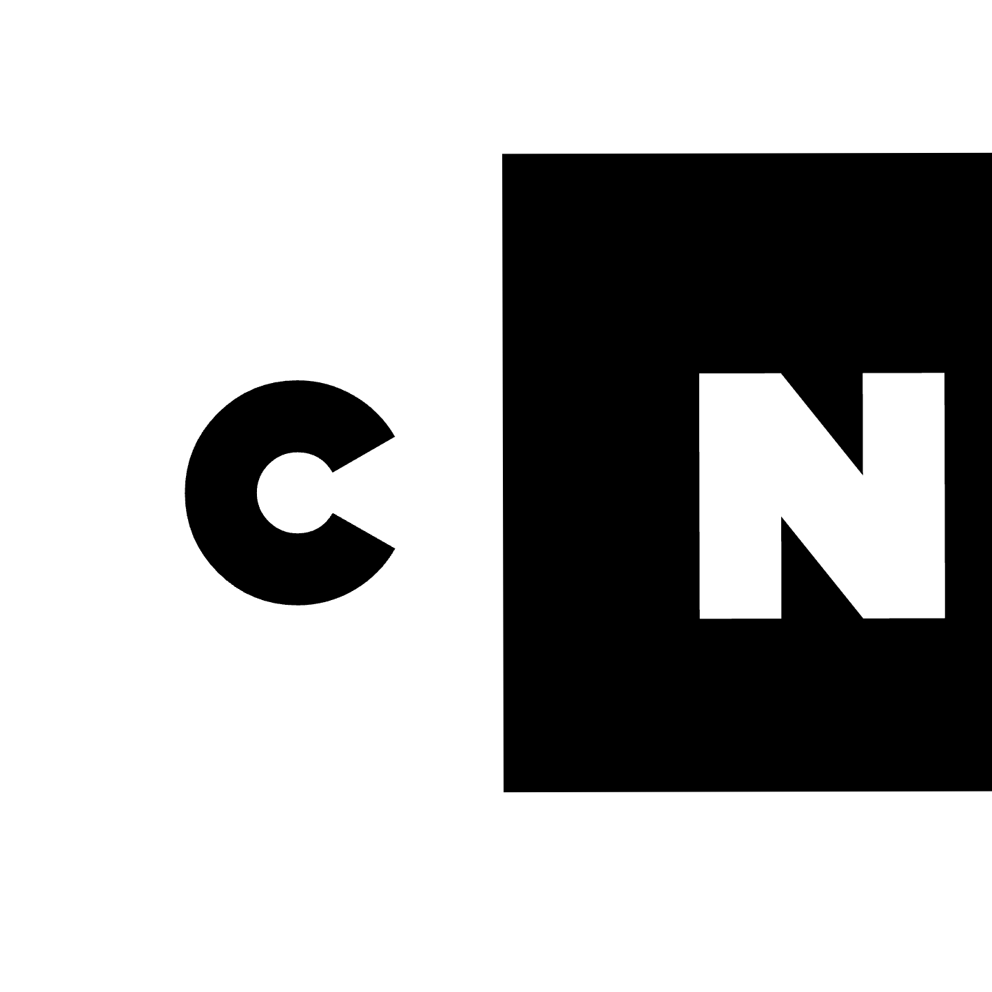
I chose Cartoon Network and after researching more about the brand and its history, I analyzed the logo and started to sketch based on its features.
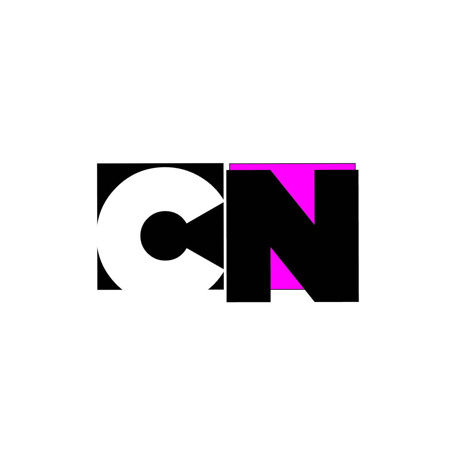
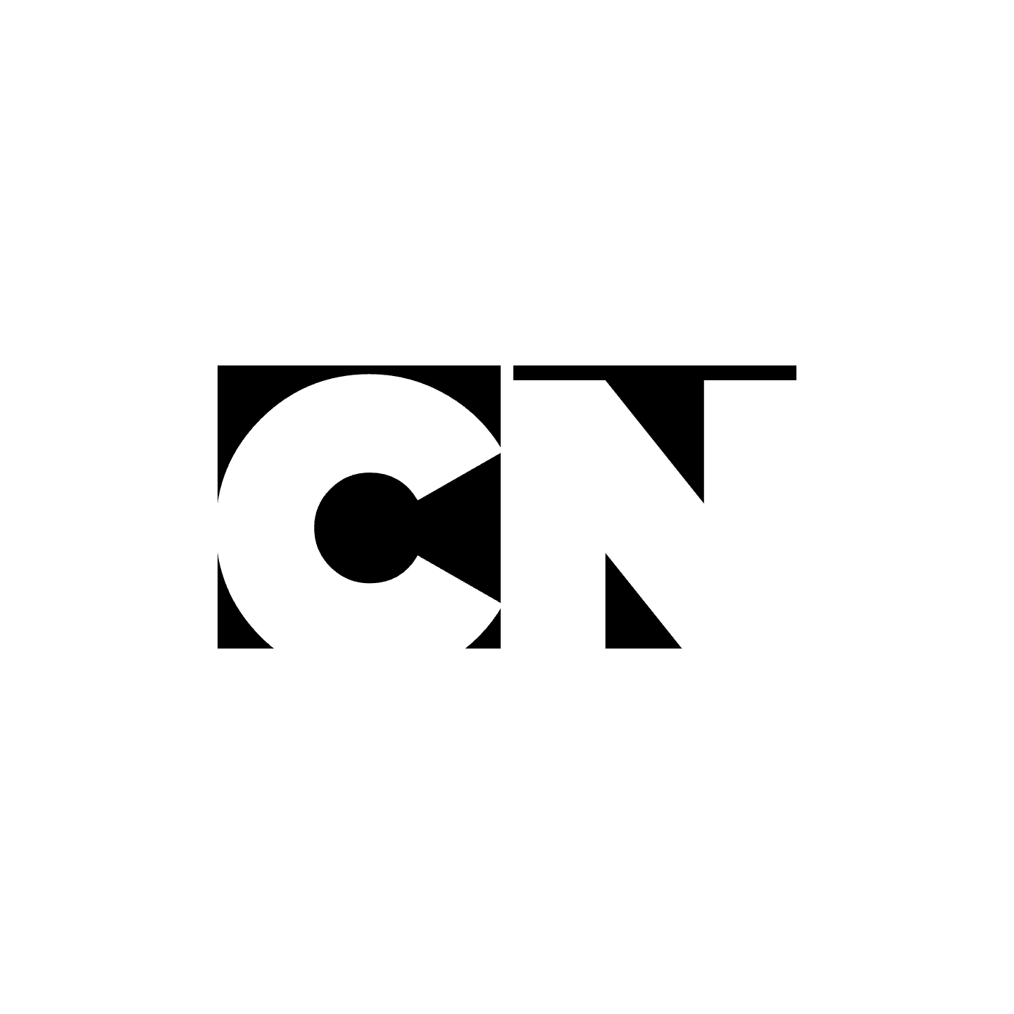
The logo uses a simple black and white color scheme and two squares. It is easily recognizable and symbolic of the playfulness of the company. It uses a custom font and has timeless relevance.
Development
Initial sketches
Digital Sketches
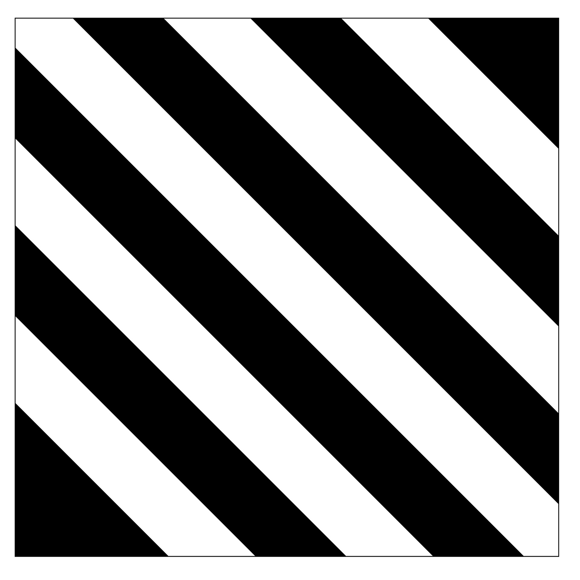
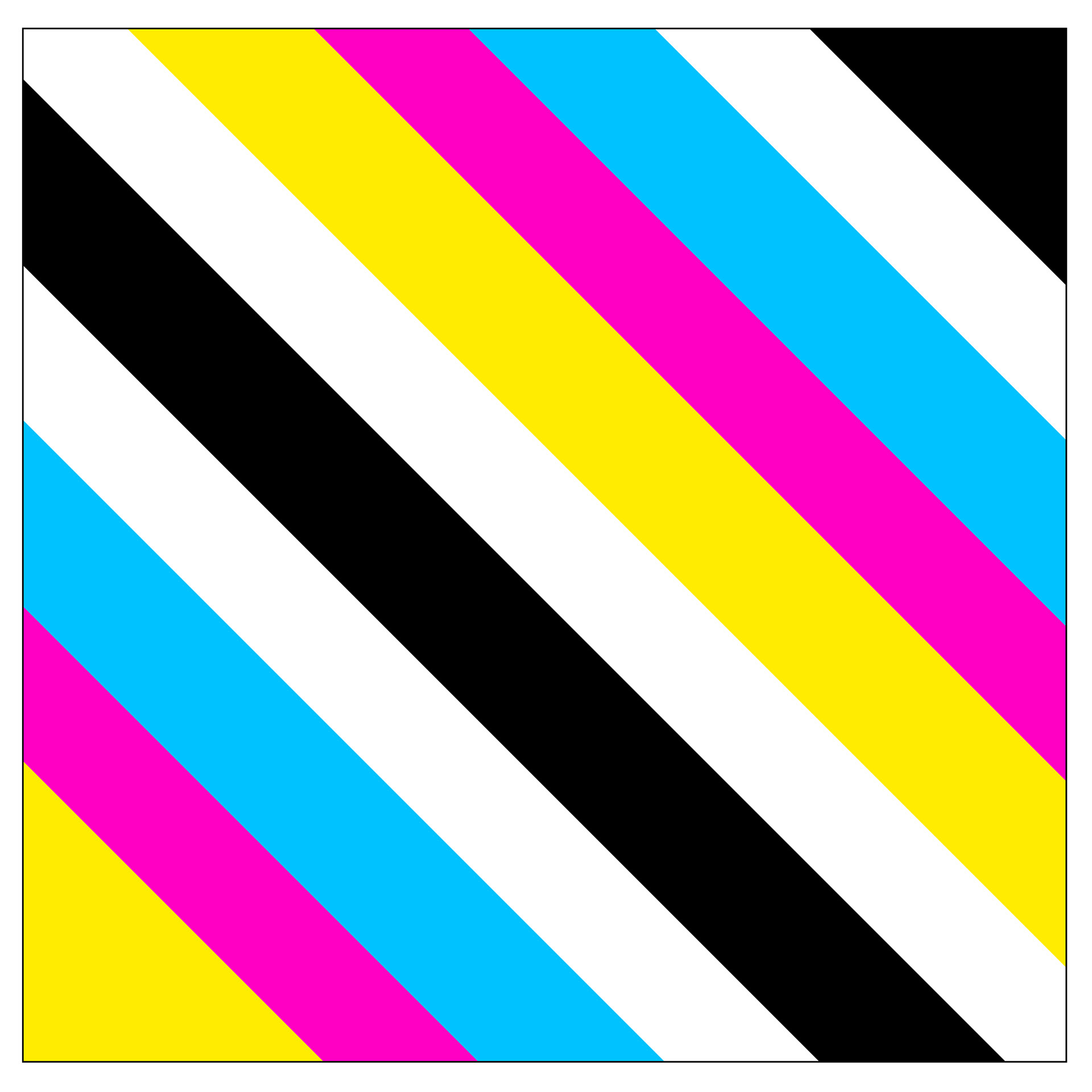
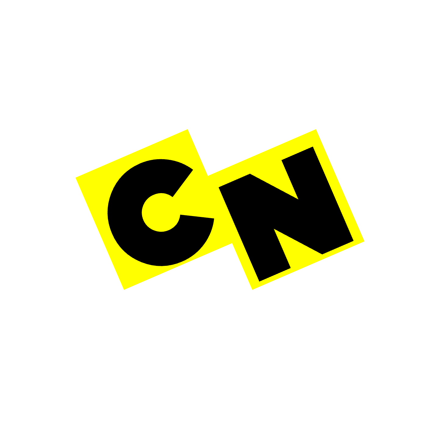
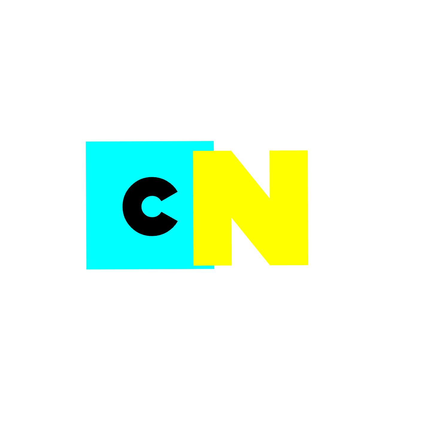
I wanted to use shapes to convey the brand identity of Cartoon Network. I also wanted to incorporate the CMYK color scheme as well as the grid-like systems that shows the fun nature that resonates with the audience. The shapes, colors, and grids are associated with nostalgia and enjoying cartoons.
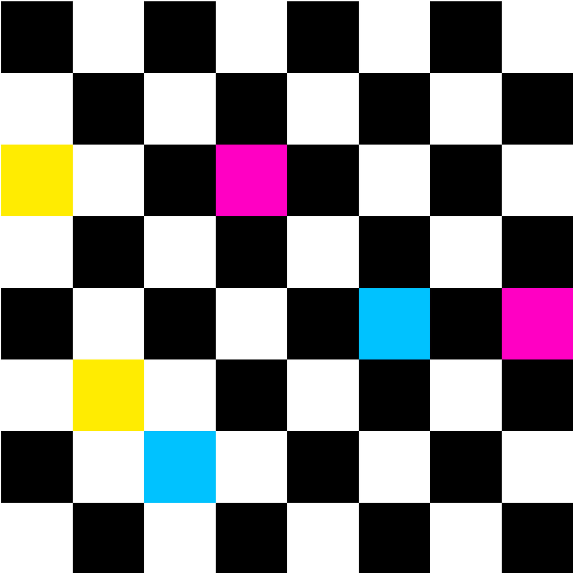
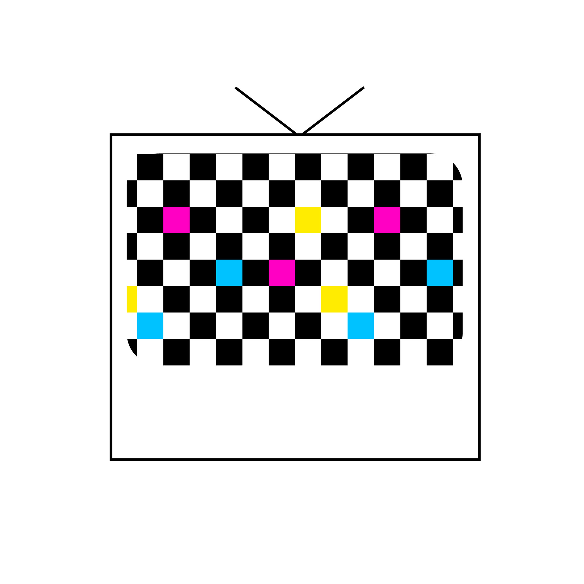
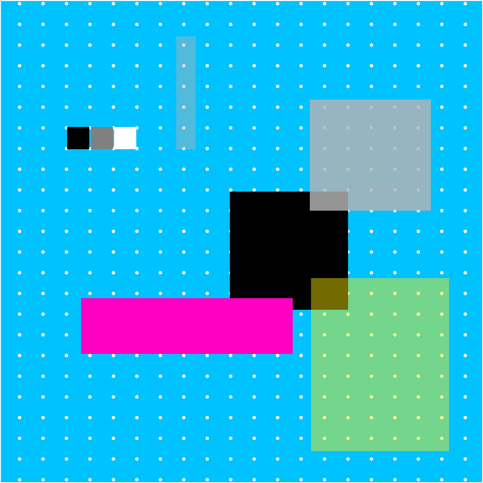
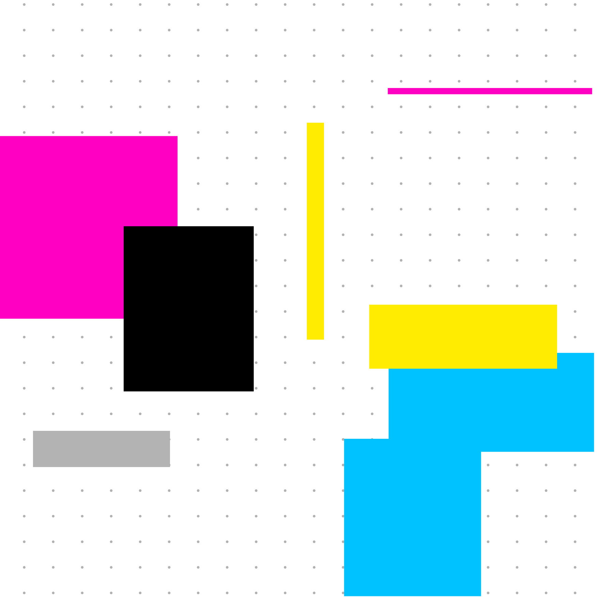
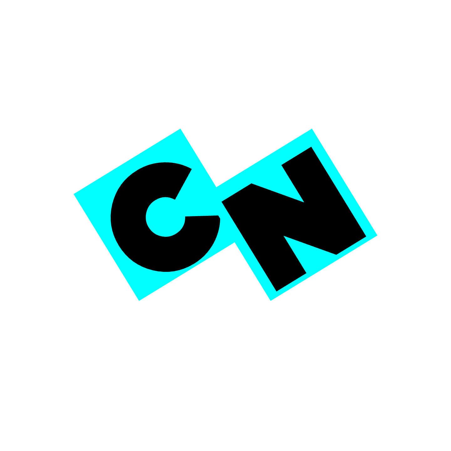
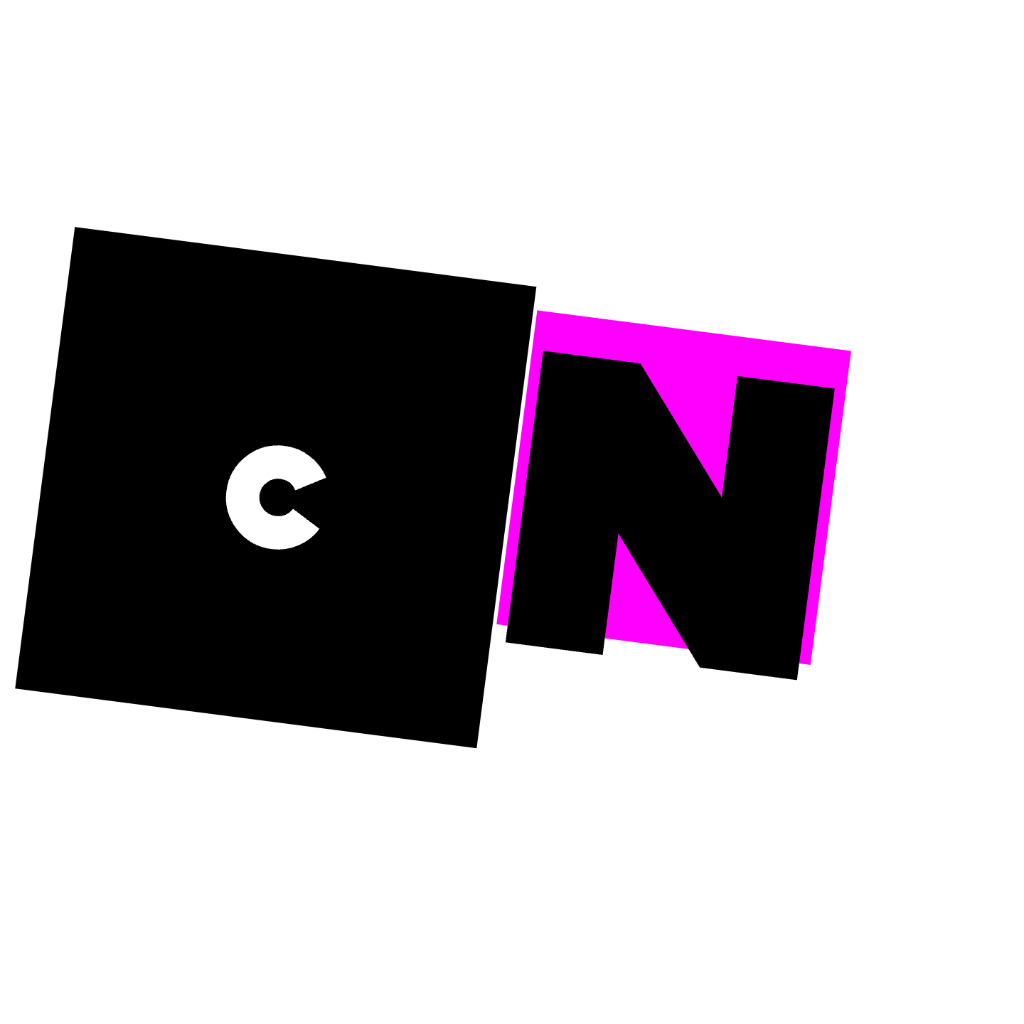
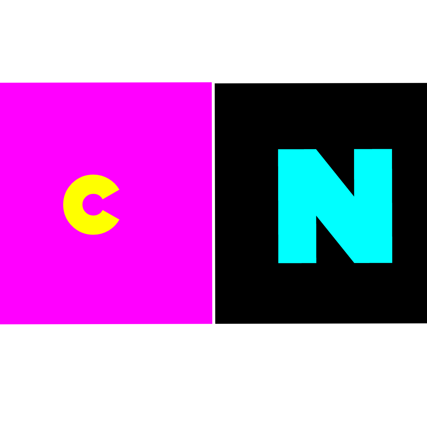
Coded Sketches I
The first coded sketches explore the CMYK color model of Cartoon Network’s brand identity. They also explore a use of negative space, size, and rotation. I decided to add the colors one by one into each sketch and into the checkerboard key. This way the iterations do not become too busy and keep contrast in the background, colors, and shapes.
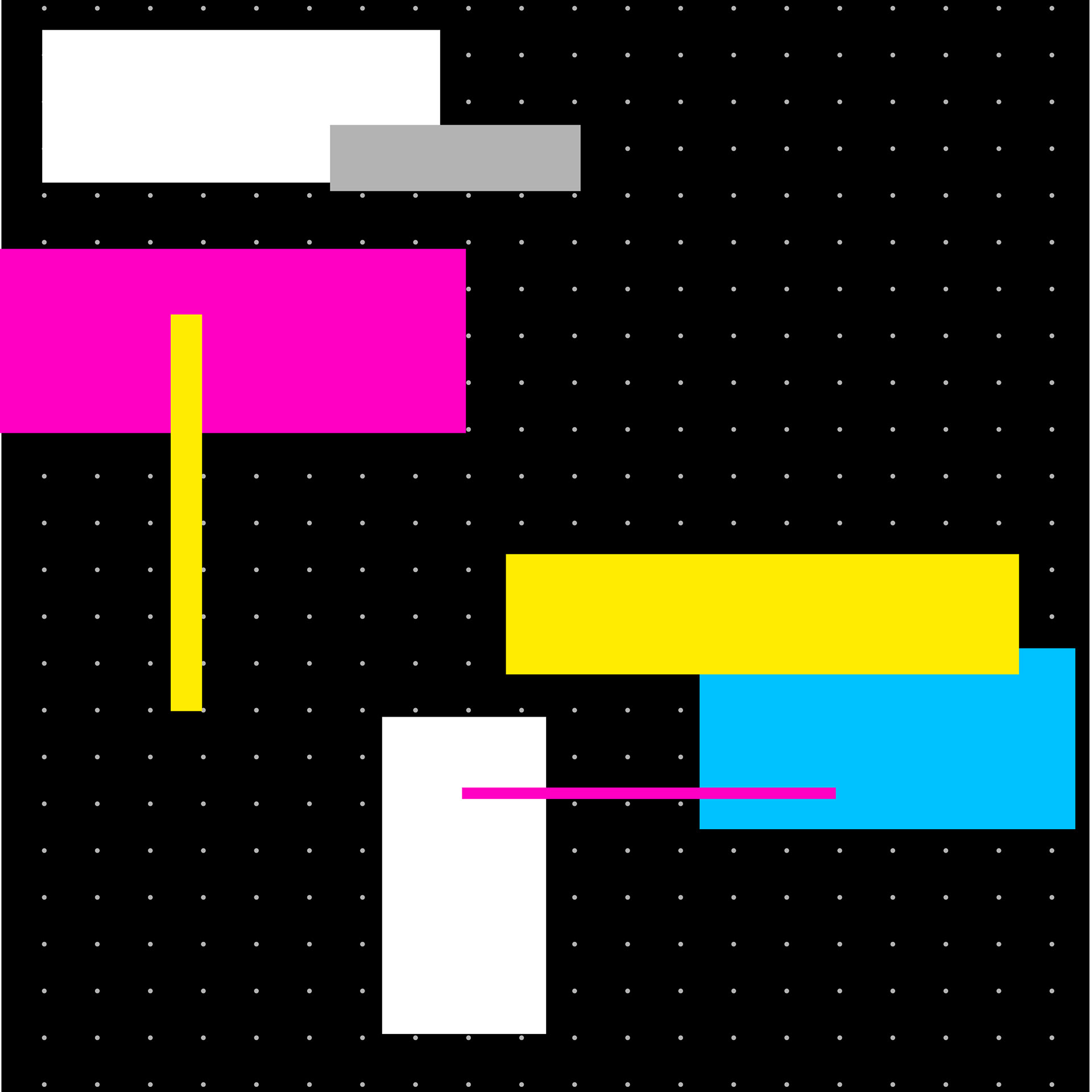
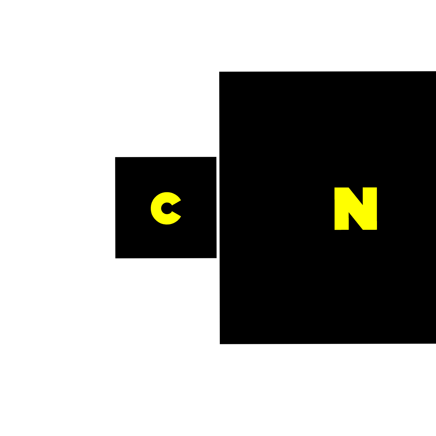
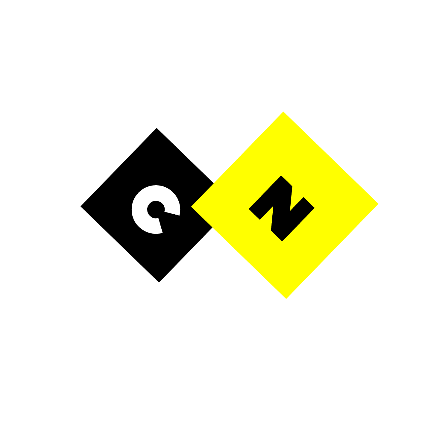
Coded Sketches II
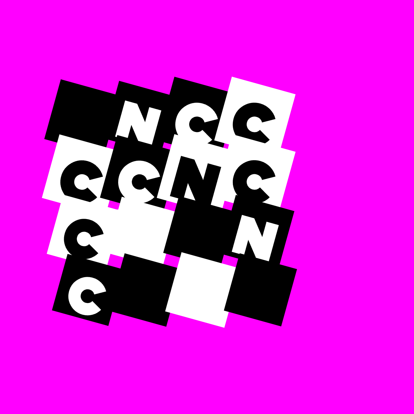
For these sketches the rotation of the letters and squares is based on mouse position. The mouse was towards the bottom left of the screen and the letters randomly generated to be small enough to fit within the square and be equal size to each other. The colors of the letters and squares change randomly on mouse press.
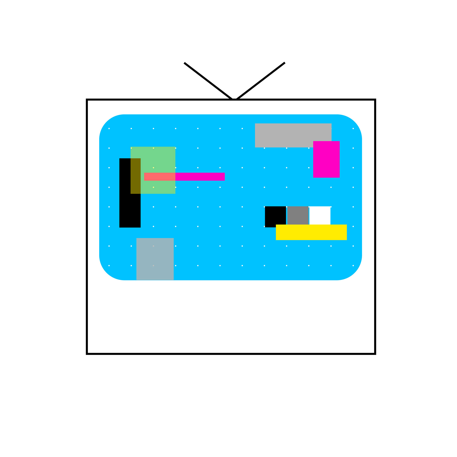
Coded Sketches III
These sketches represent different staples of the Cartoon Network brand. They all feature the classic checkerboard and the vibrant CMYK color scheme. They each tell a different story and are uniquely interactive. Each sketch has a “CN” mouse because my thought process was that these interactions could be applied to something interactive. I experimented with the grid and how I could cause disruptions in it while still preserving the brand identity.
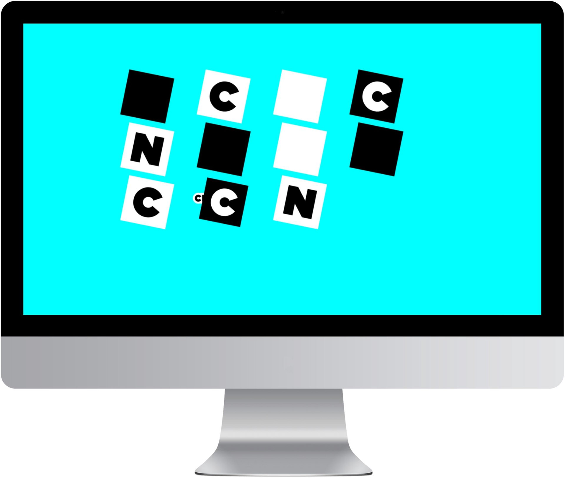
This sketch starts off as a full checkerboard grid and the mouse hovering over a square lets it change colors to either magenta, cyan, or yellow. The square also rises above the rest of the grid. When mouse is pressed the checkers move in an explosion sort of pattern and the mouse hover effect continues. Mouse press then reverts the grid back to its original checkerboard state.
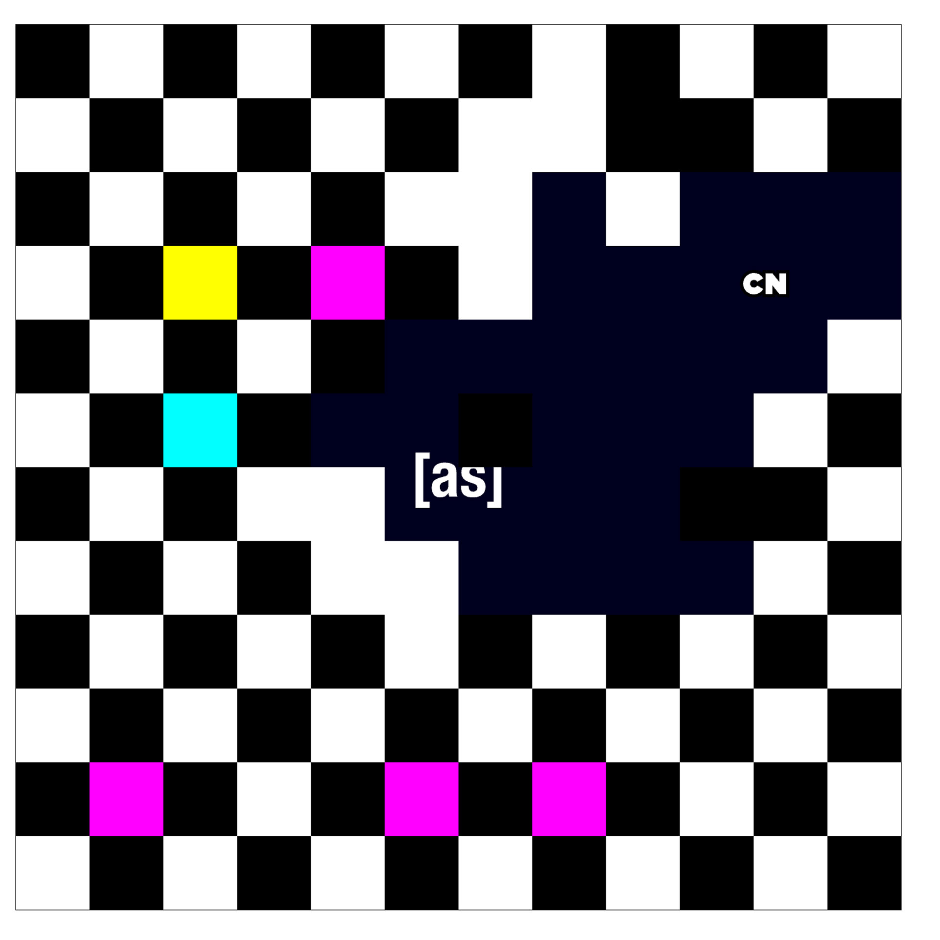
This sketch is a play on the adult swim branding and advertising of Cartoon Network. The checkerboard grid starts out with more color and a white background with the logo that is revealed through the grid by mouse position. When the mouse is pressed the background changes to black representing night and the Adult Swim logo is revealed through checkers that are now mostly black and white with less chance of color generation to represent the more mature audience.
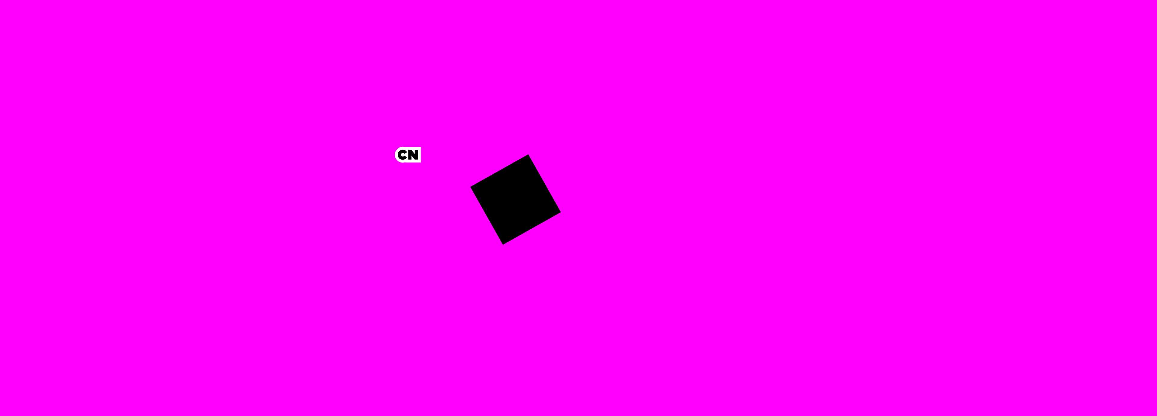
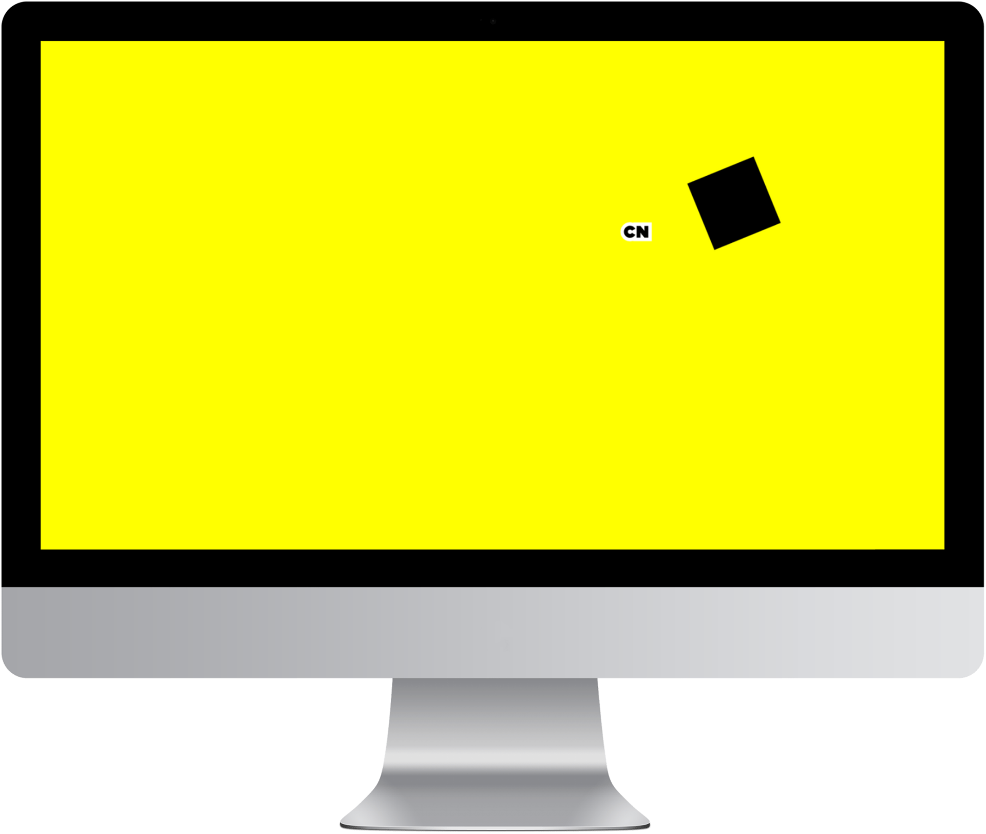
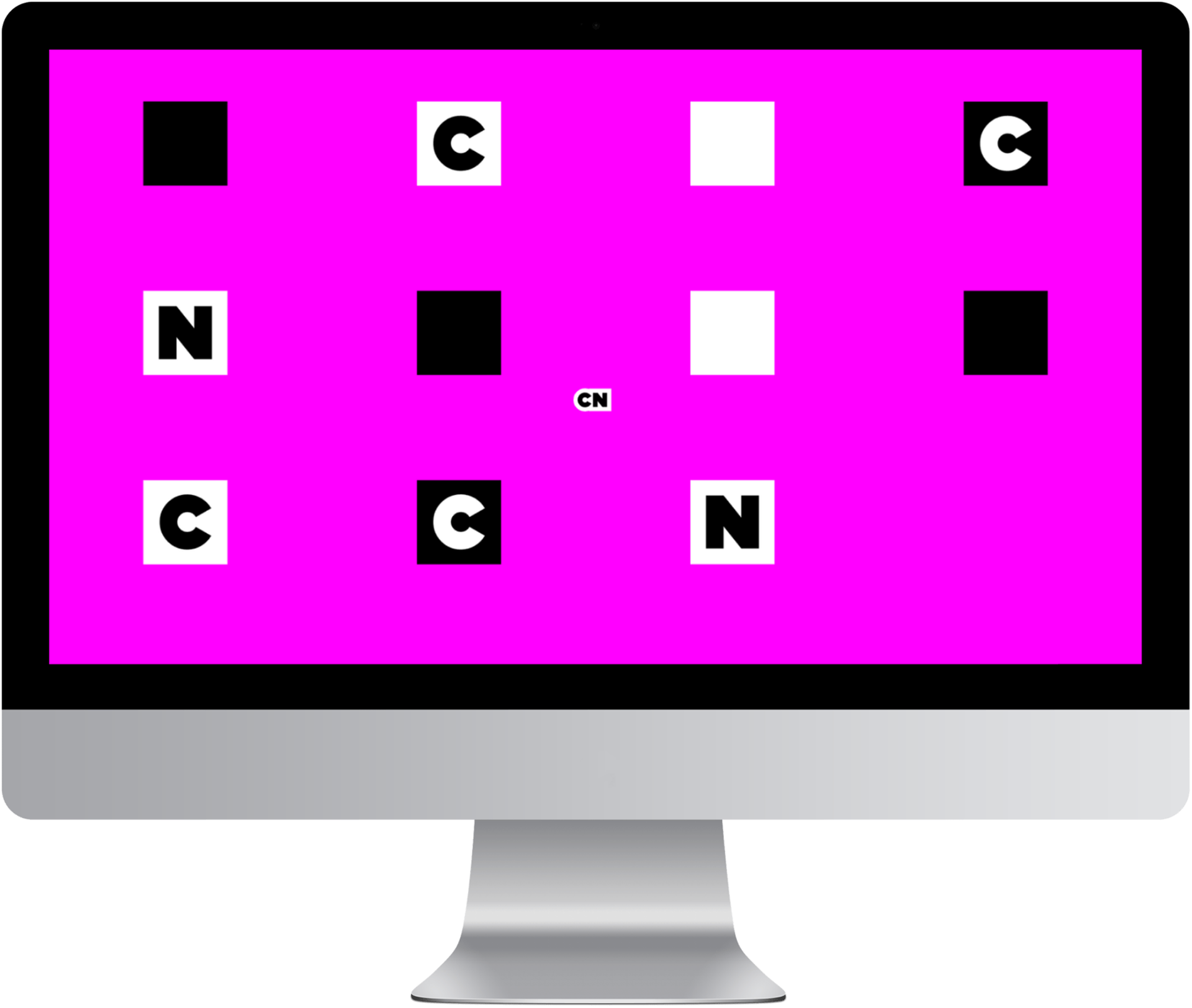
This sketch starts on a white background with one black square that follows the mouse and bounces off the edges of the canvas. When mouse is pressed the background color changes to magenta, cyan, or yellow randomly. Mouse press also freezes the squares in motion. When space bar is pressed, more squares are added with random “C” and “N”. When the mouse is in the center of the screen the squares align to the grid.
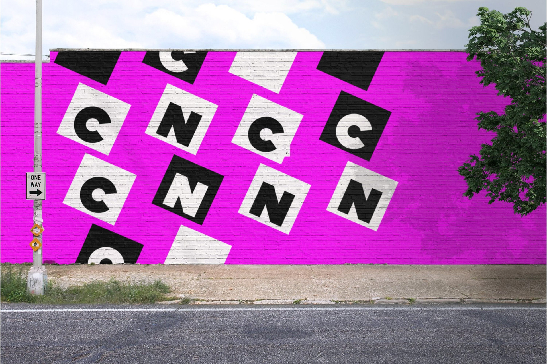
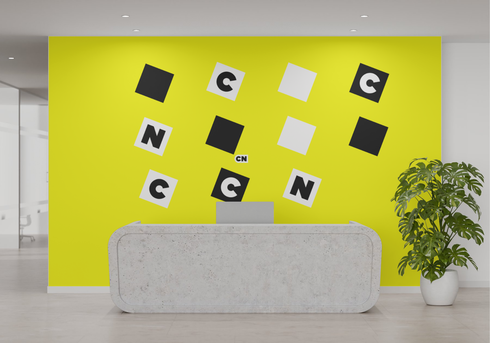
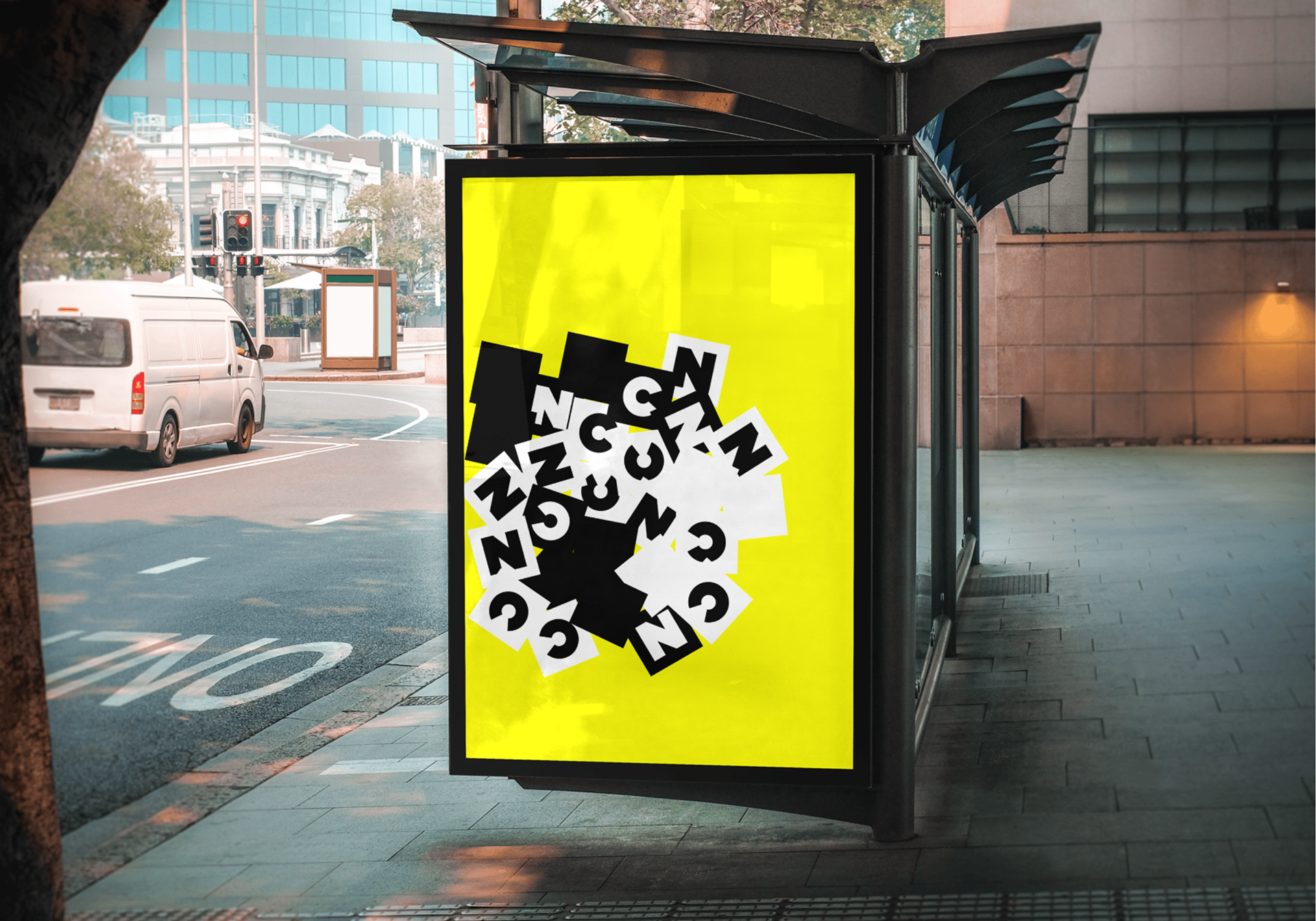
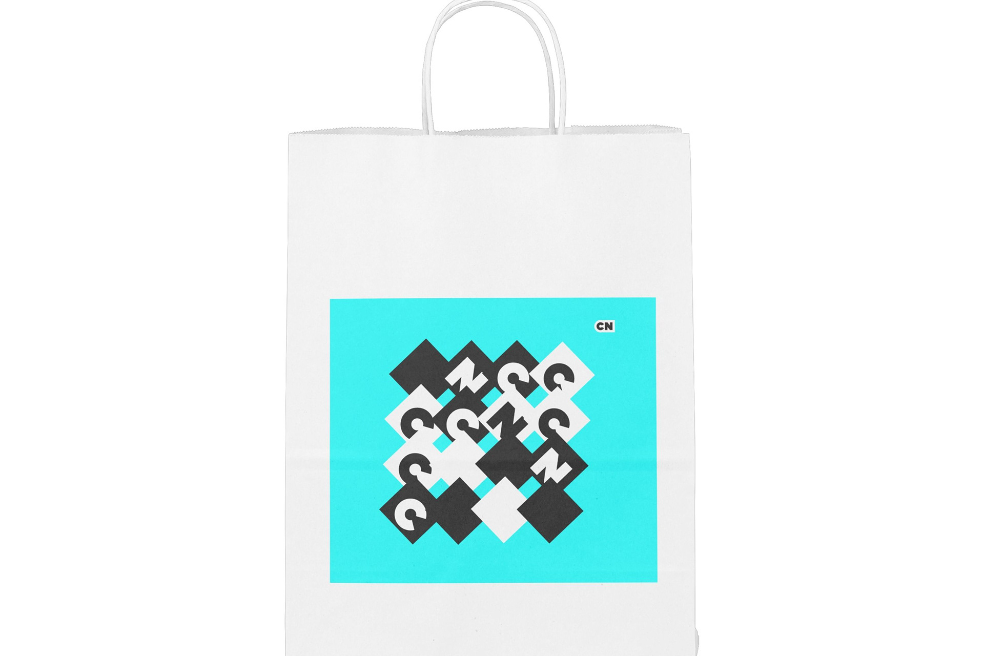
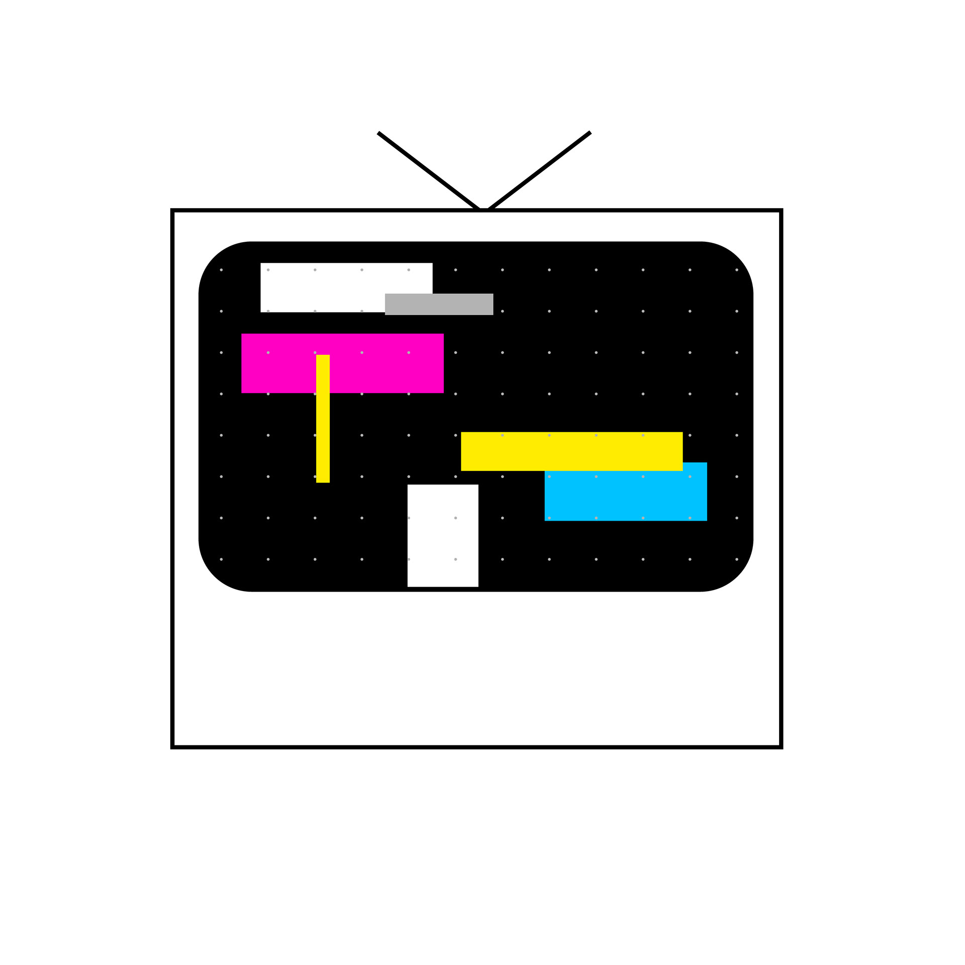
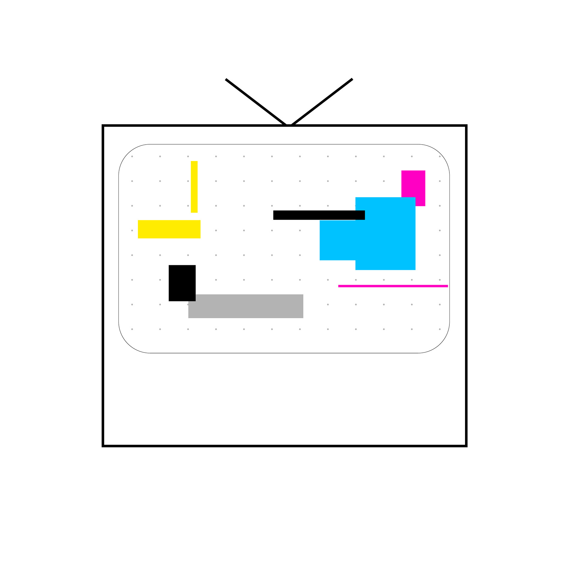
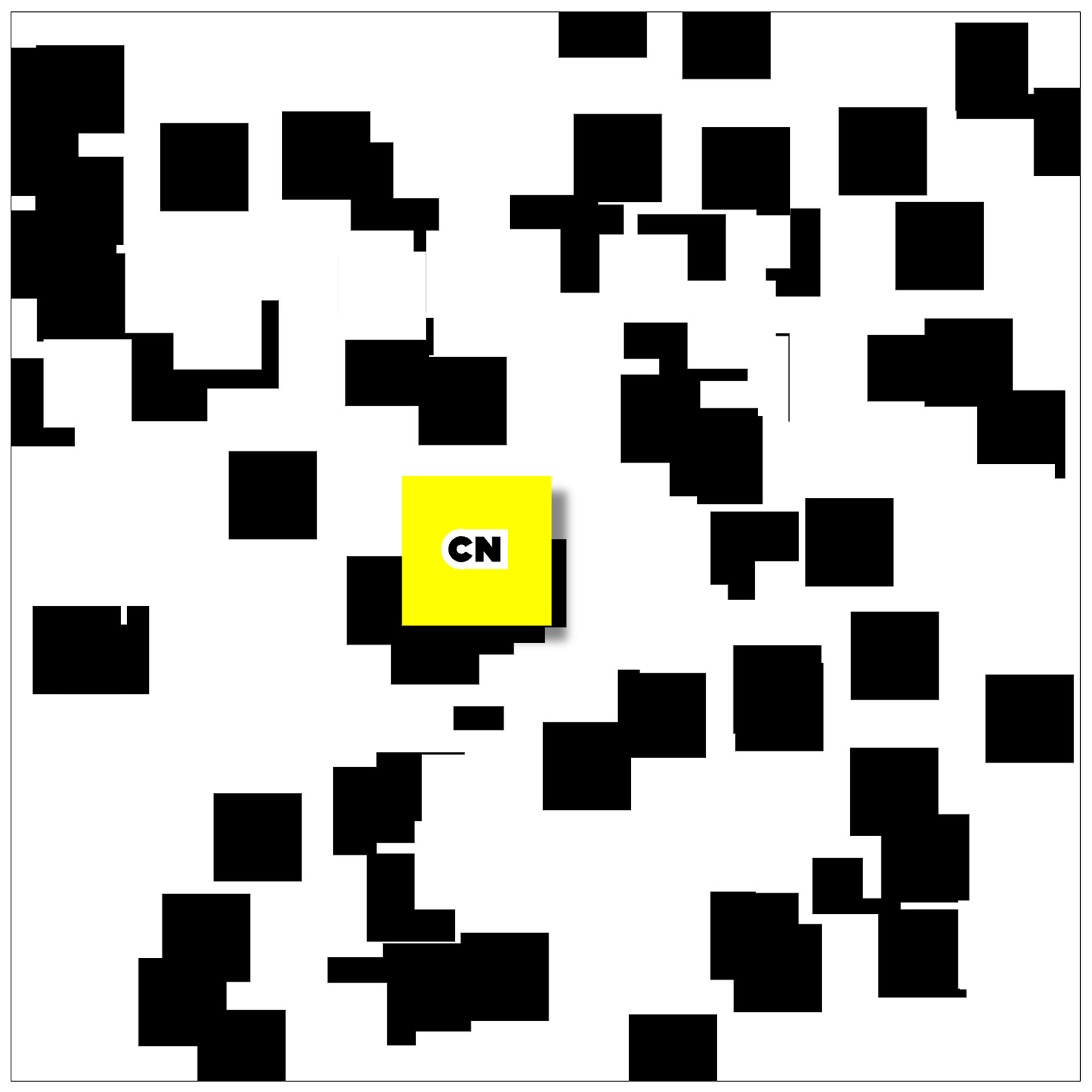
Real World Context
This mockup is for a possible loading screen, game, or other website context. Since it is interactive and has the logo as a mouse it could be used for many instances and displays the fun yet simple aesthetic of the brand.
These are final mockups are potentials for building wall wraps, marketing posters, and packaging.