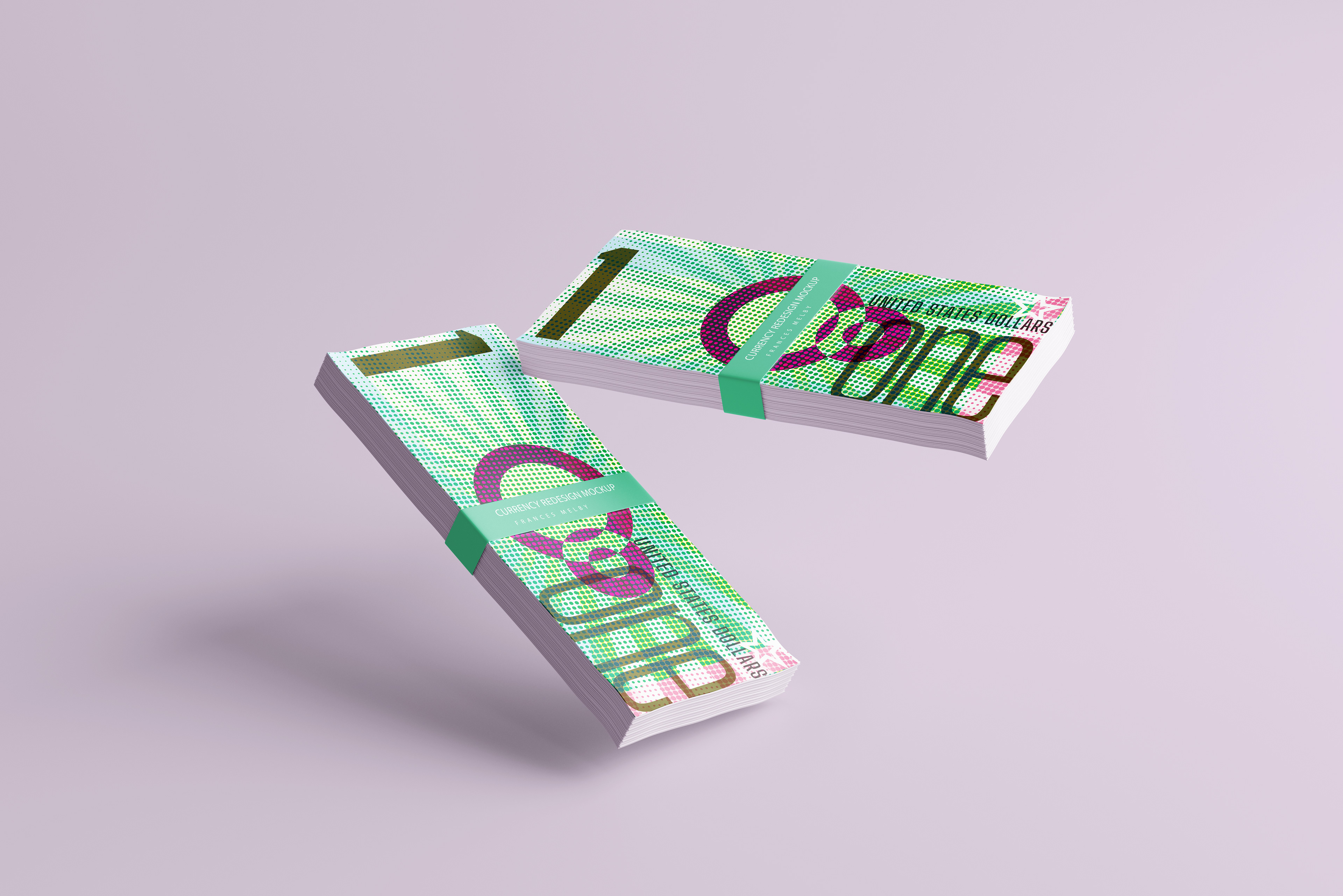
Objective
The goal of this project was to design a set of currency inspired by a particular design style. The parameters of the project were to include five denominations, be designed to look like it belongs to the design style by using appropriate visual elements, and making the series of notes cohesive while allowing for variation between each individual note.
Design Style and Research
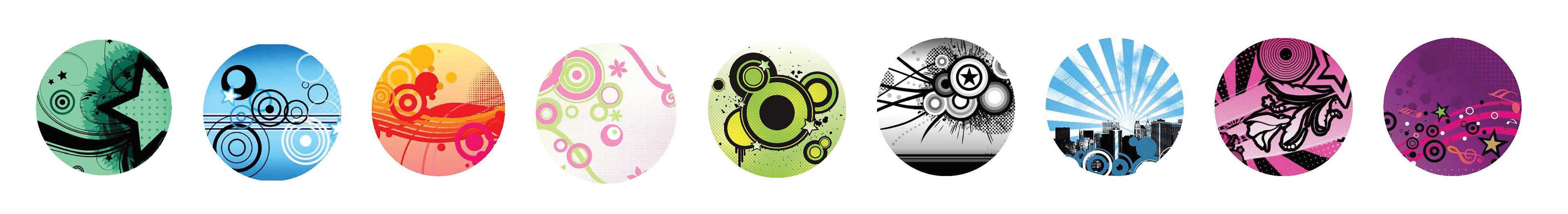
The design style that I chose for this is Frutiger Metro. Frutiger Metro is an aesthetic style from the early to mid 2000s that uses vector graphics to create flat and clean shapes. It uses abstractions like gradients, flourishes, and shapes to create its effects, as well as bright hues and gradient overlays.
Development
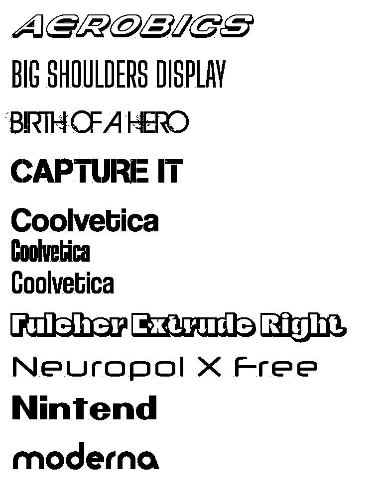
I looked into fonts that directly resemble this style and were often used along with the shapes and colors above. These fonts strongly connect with the Frutiger Metro design style and when deciding which font to use I wanted to focus on what was most important on a note of currency: legibility, and longevity. The type needs to be easily readable and stand the test of time. This is why I chose the font "Big Shoulders Display". This font seemed the most practical on currency while staying true to the design style.
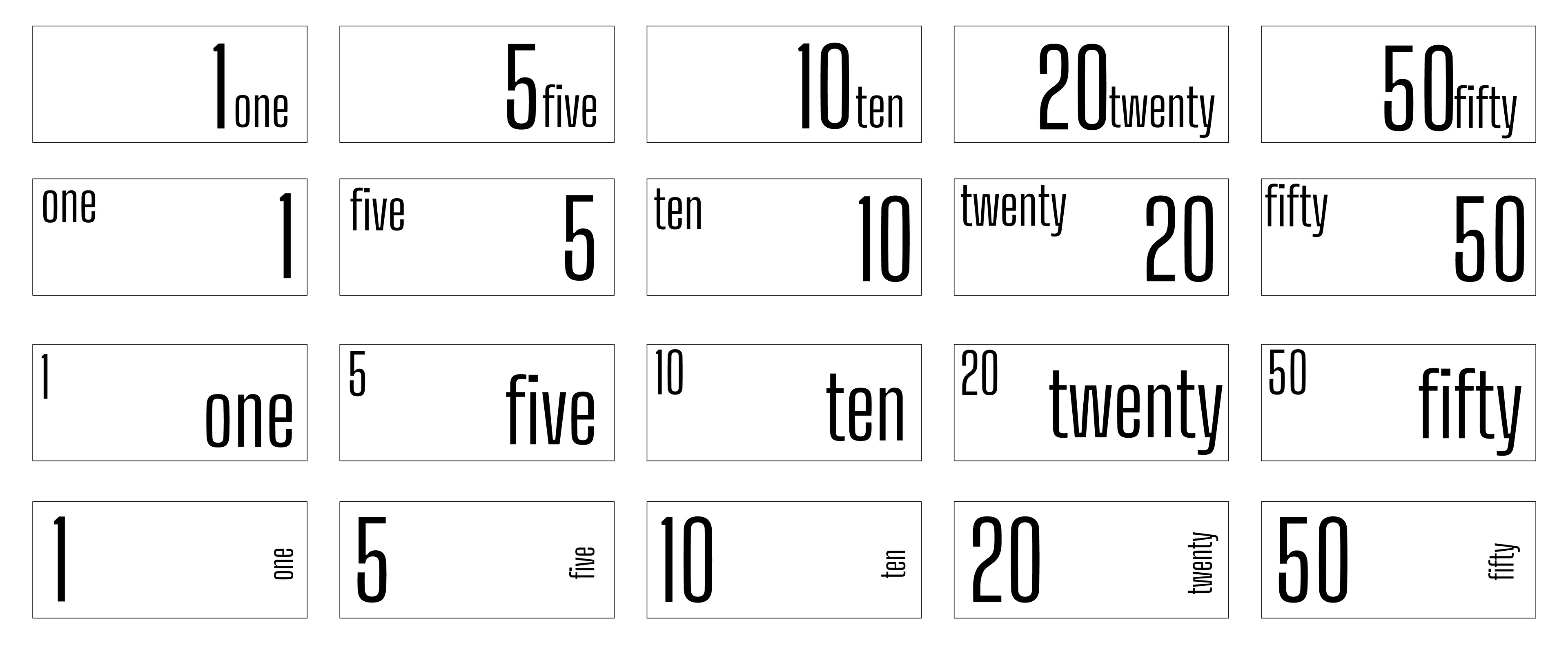
I started by adding a simple layout to start to configure where the type could lay before adding any color or other graphic elements.
After I found a type layout that worked across every note I started to experiment with other elements like shapes and colors that I could potentially add to start to create the Frutiger Metro aesthetic.
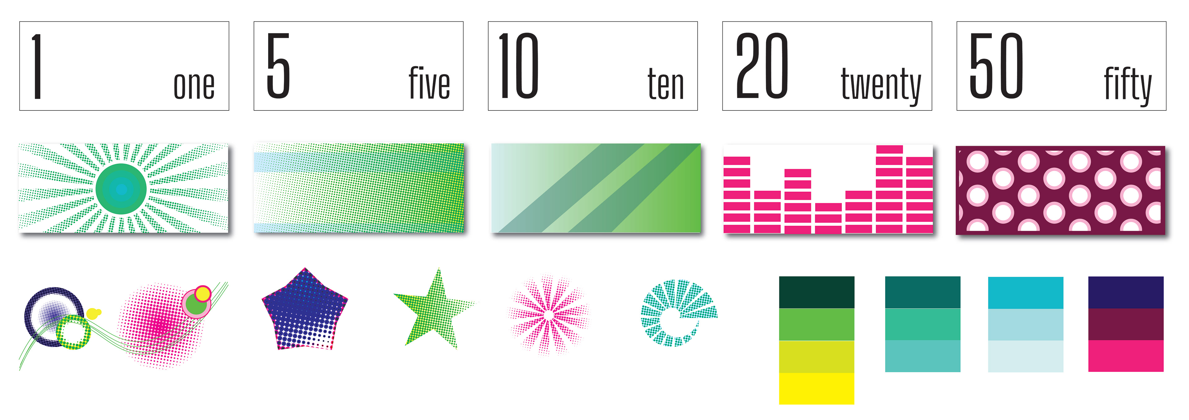
I also decided on a color palette that I thought represented the ethos of the design style and would work throughout a series of individual systems as well as within a cohesive set.
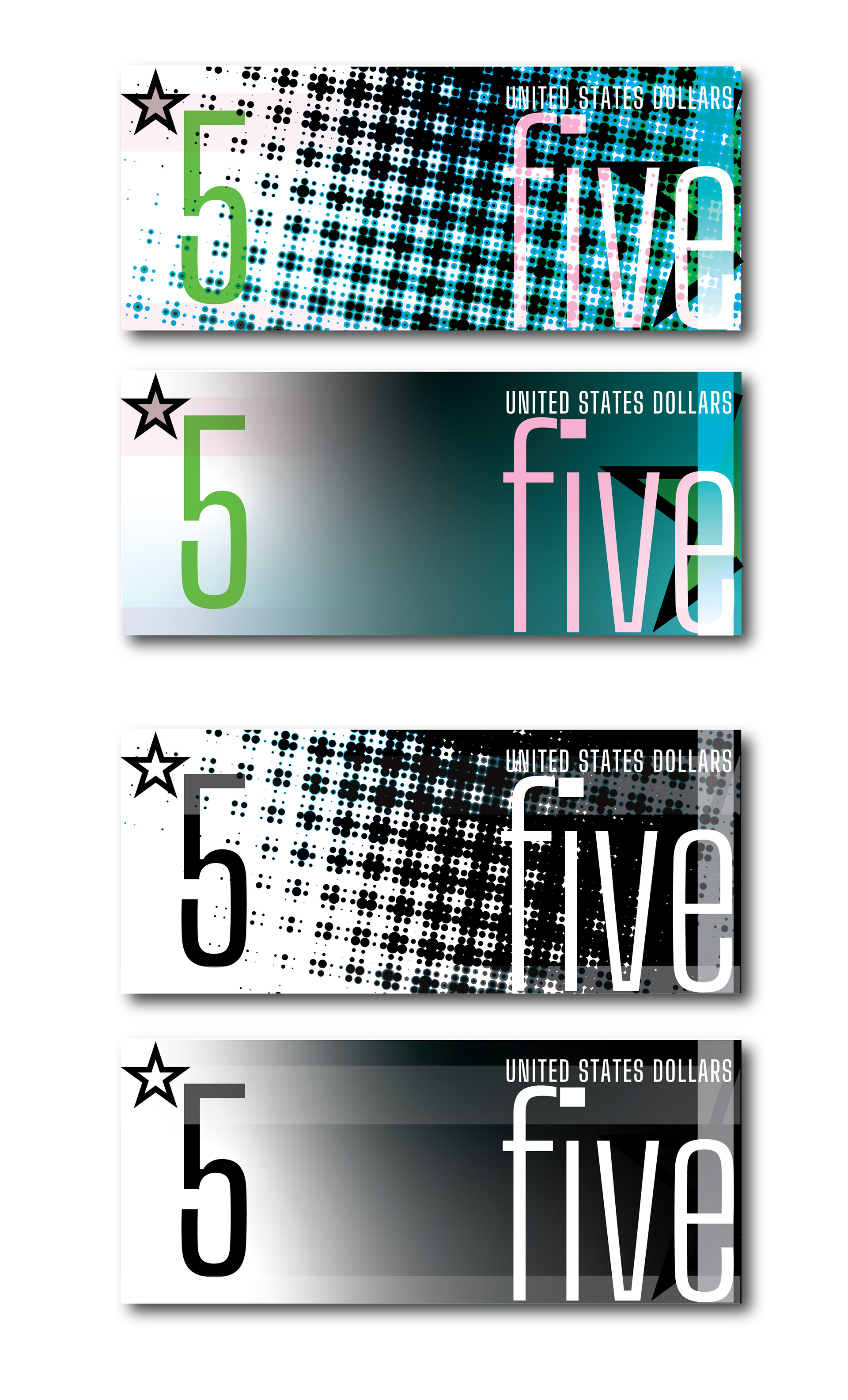
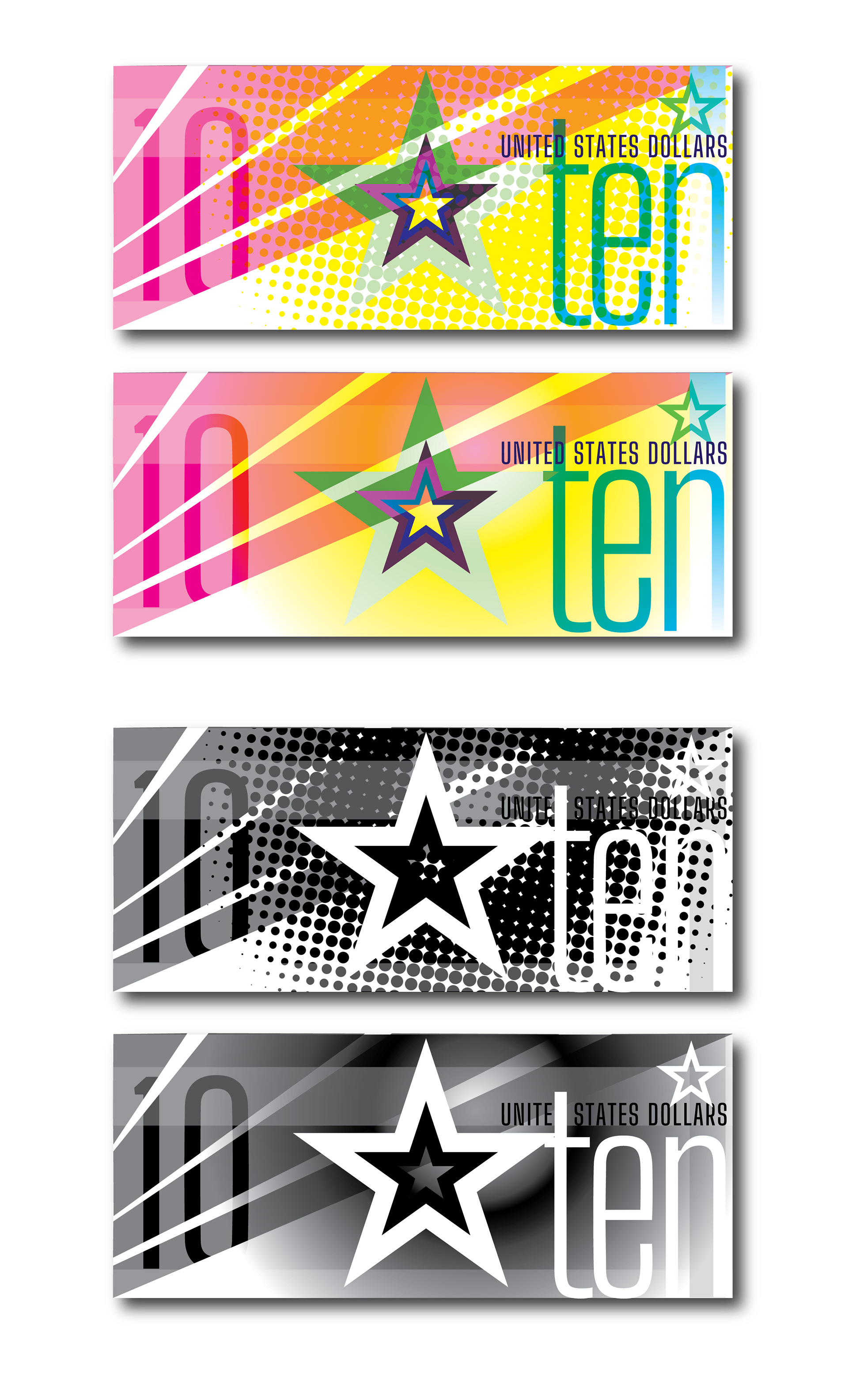
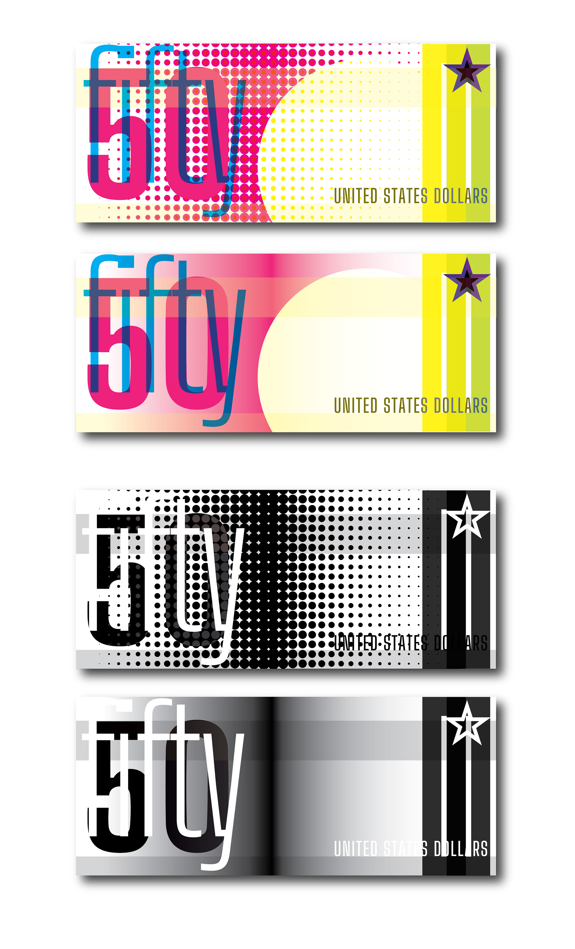
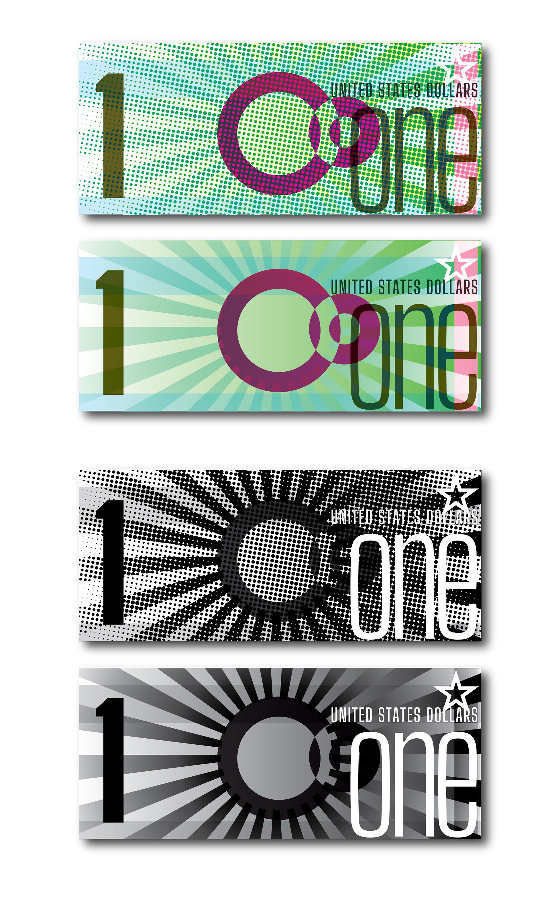
First Iterations
I began to incorporate the type with the other elements and experiment with different textures and details within the separate notes while keeping some of the shapes and textures consistent.
I noticed that certain details within the elements started to become distracting or take away from the legibility of the type. This is when I decided to simplify the designs a bit more in order to create more successful and practical designs.
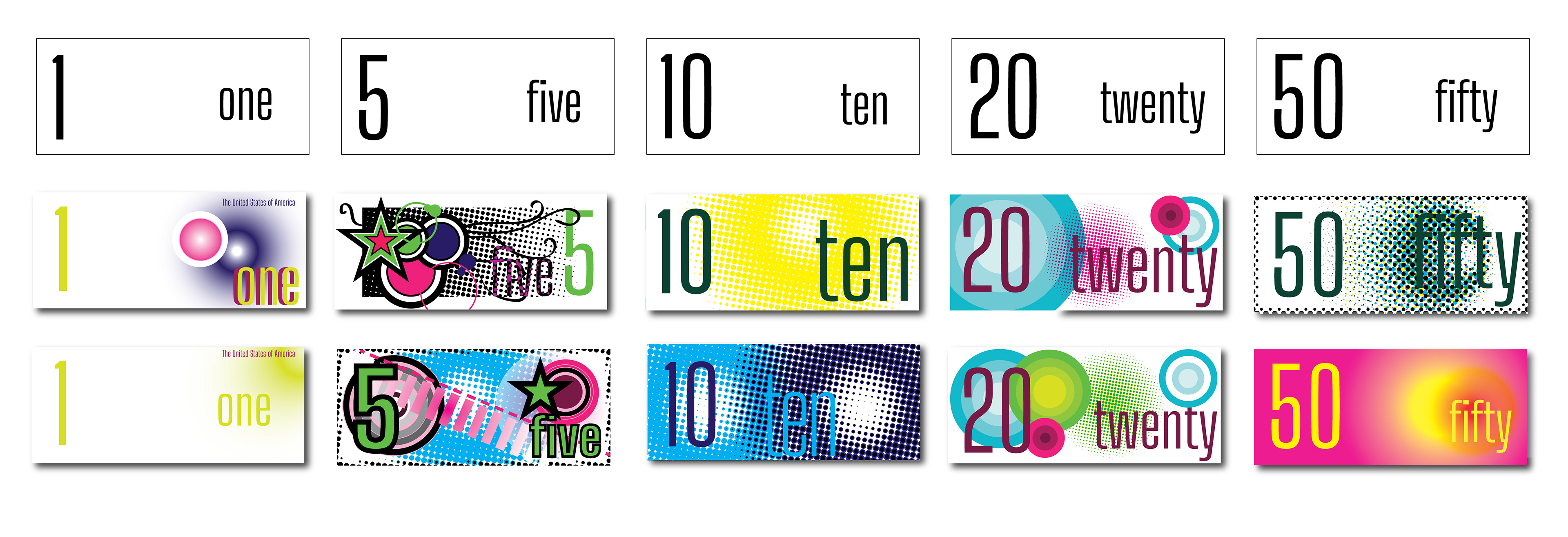
Final Iterations
After creating my final iterations I made sure that they were still just as successful as systems by taking away the textures and colors. This was the final step in ensuring I was pleased with my final notes.