Objective
Choose an album that you resonate with or that inspires you and create a front cover, back cover, and side A and B stickers that represent the music visually and emotionally.
Create images that portray the sounds and feelings of the chosen album and using typography and design elements in order to create a realistic album and create a physical copy as the final product.
Process
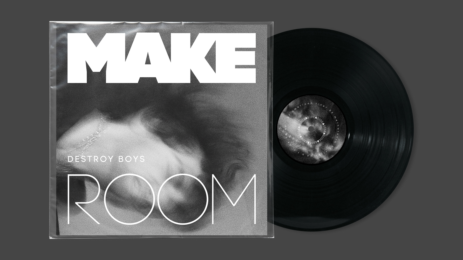
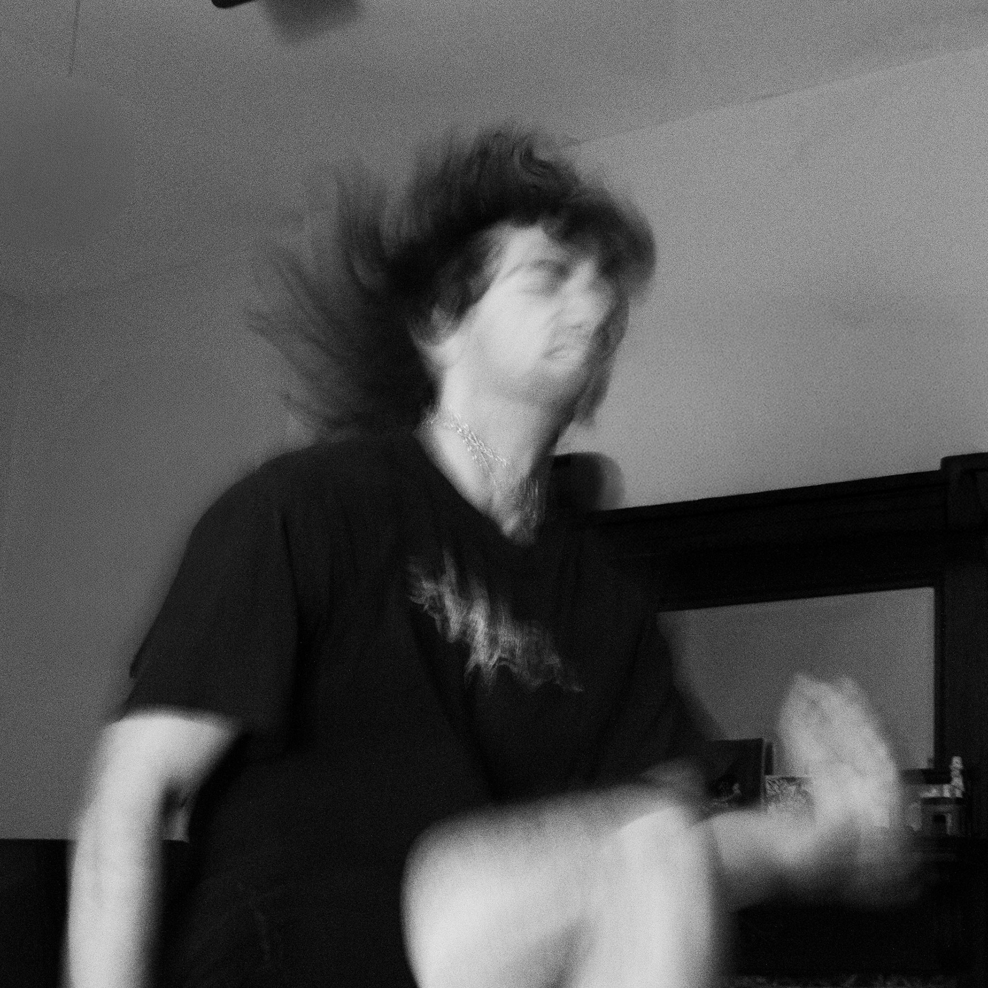
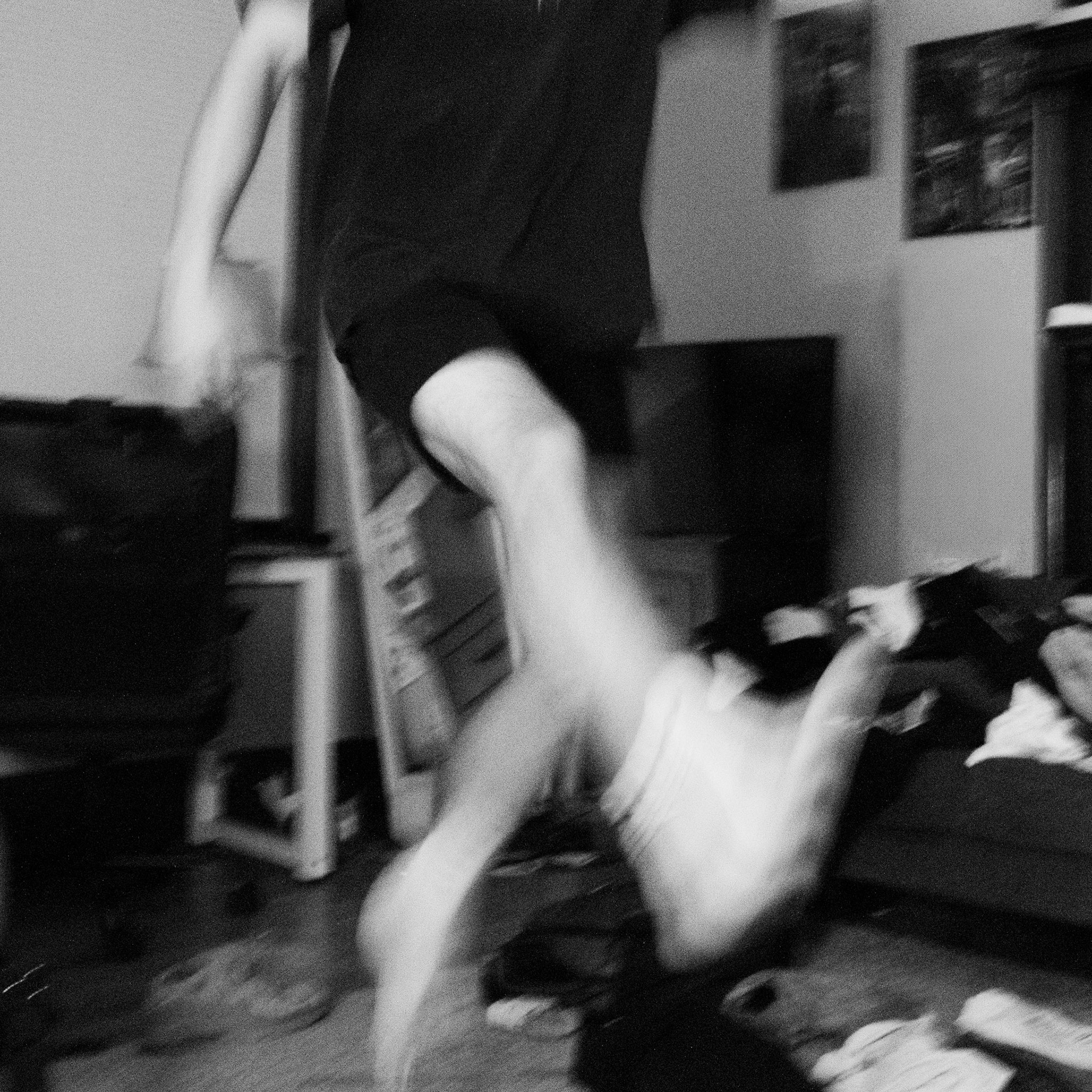
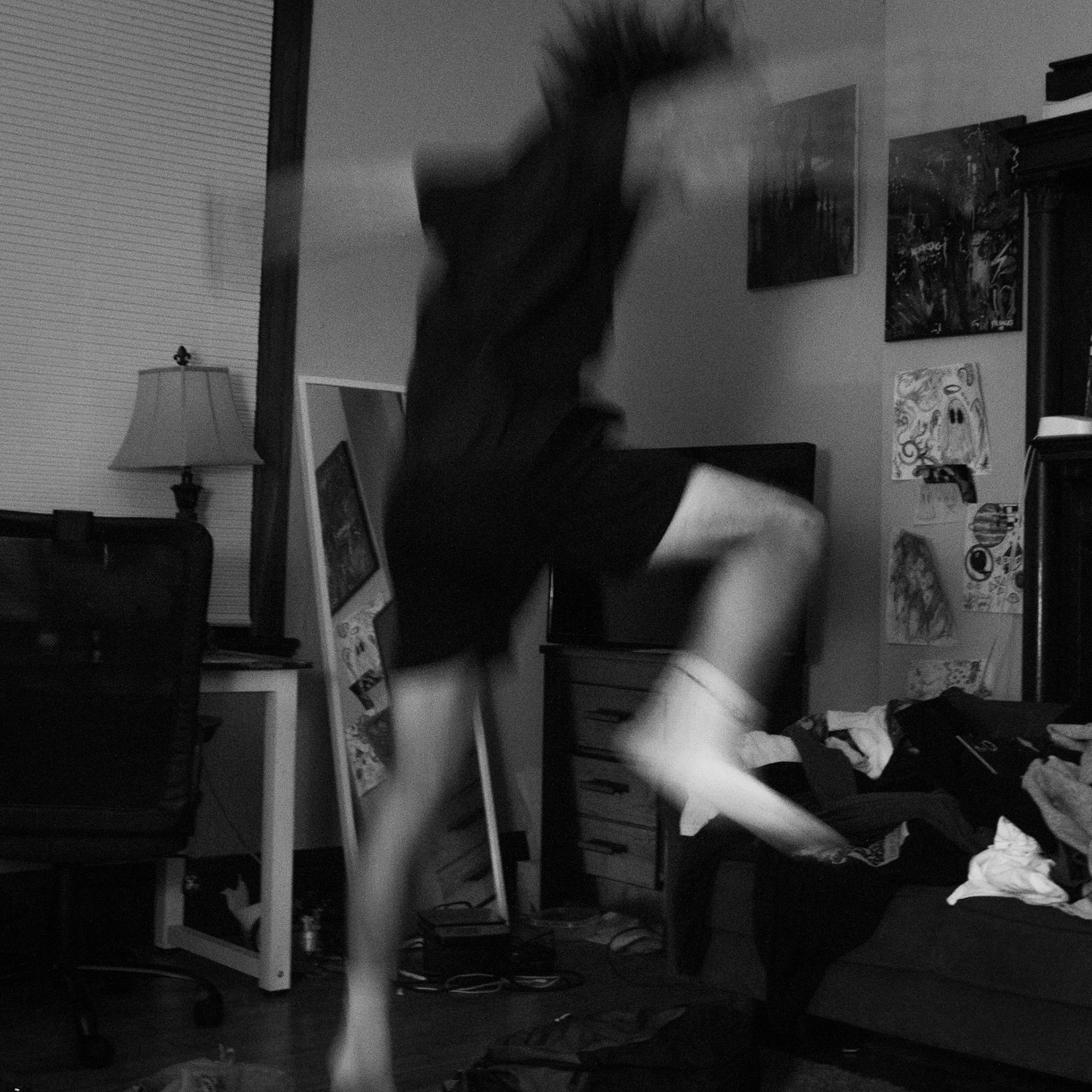
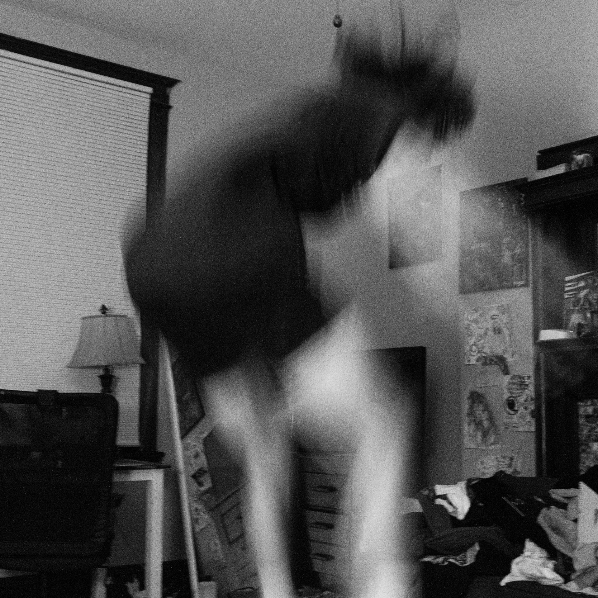
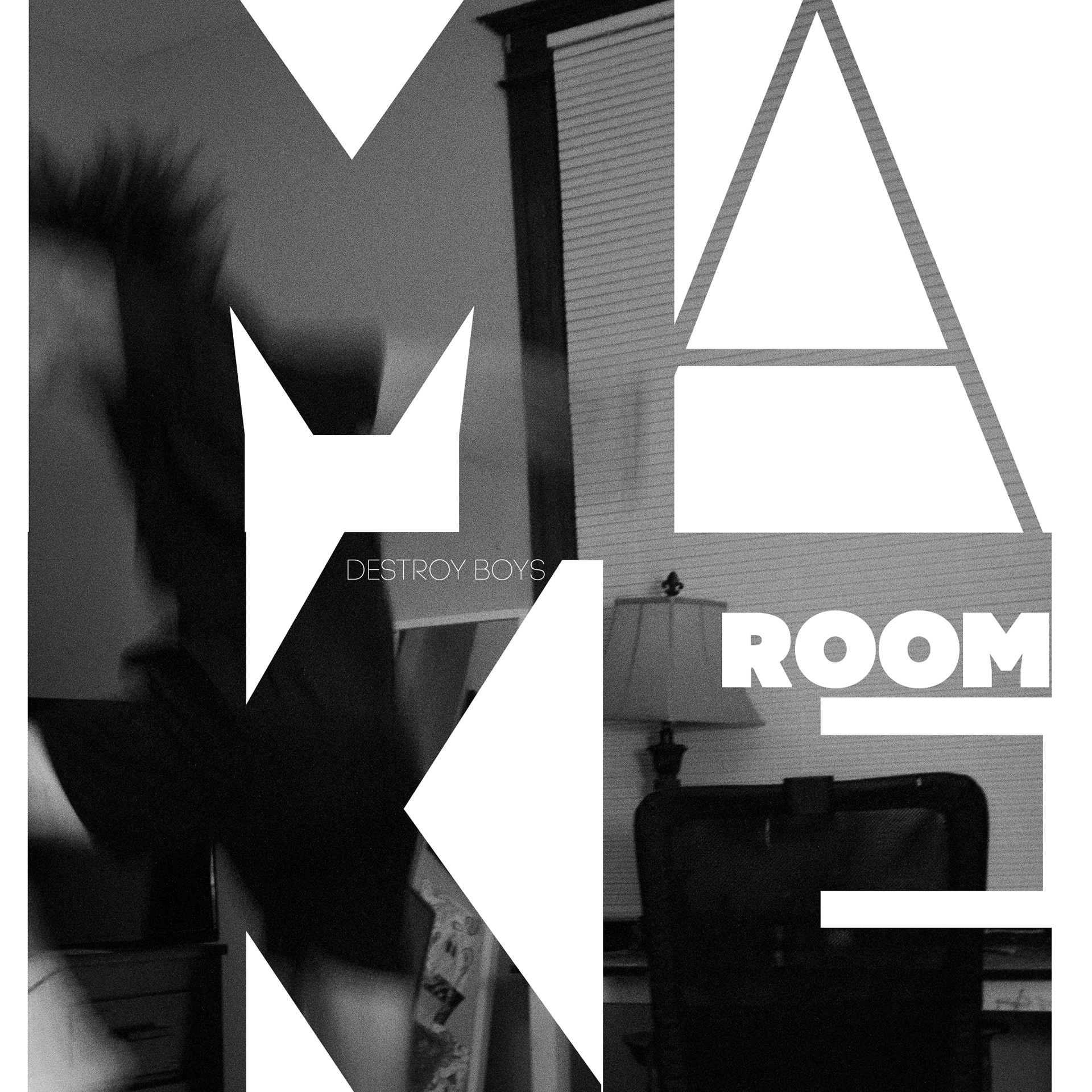
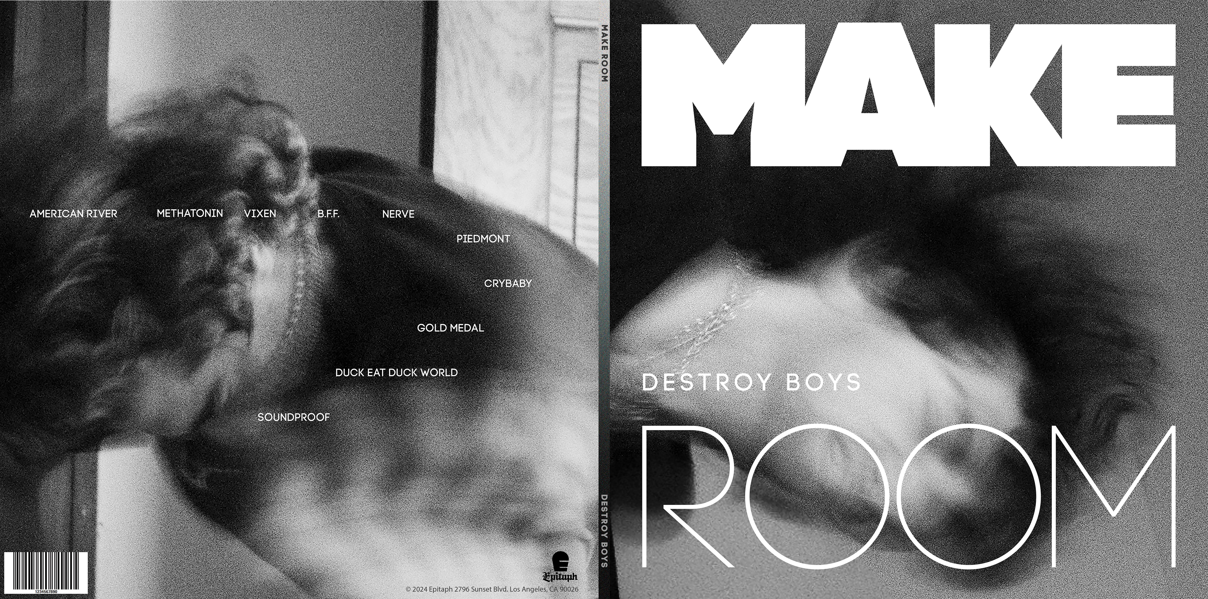
I chose the album Make Room by Destroy Boys which is a Garage Rock album that to me represents angst and expressing emotions in an aggressive, yet freeing and honest way.
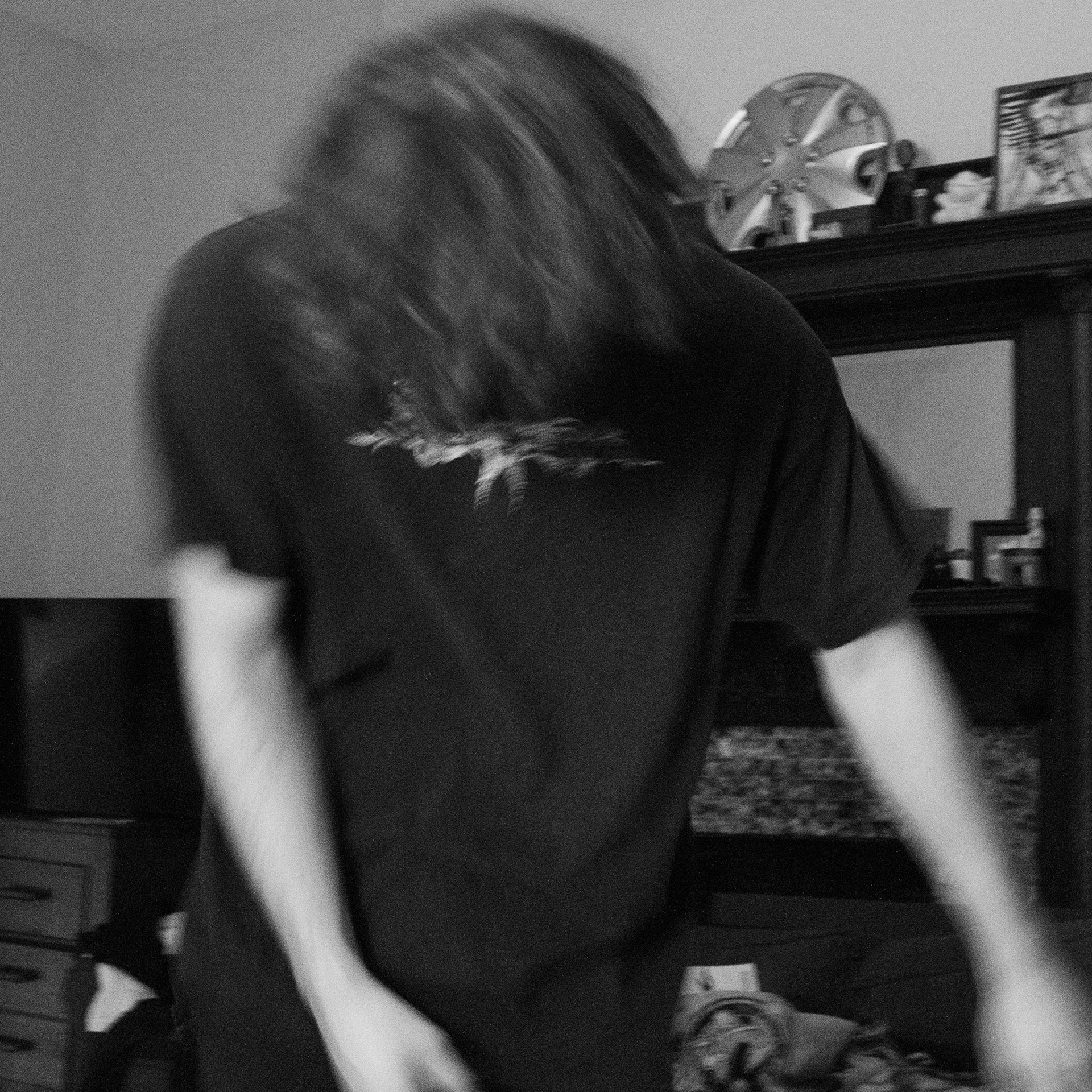
I thought that motion would capture this raw feeling very well. I had my subject act as if he is dancing violently or in a mosh pit at a concert and letting out energy. The jumping and thrashing around shows the aggressive, punk nature of the album.
I also wanted the cover to be in black and white and have a grainy texture to emphasize the contrast in the motion and expressions of the subject.
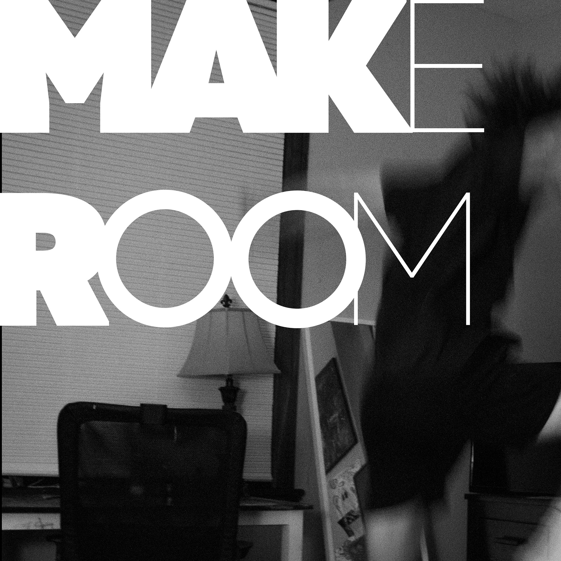
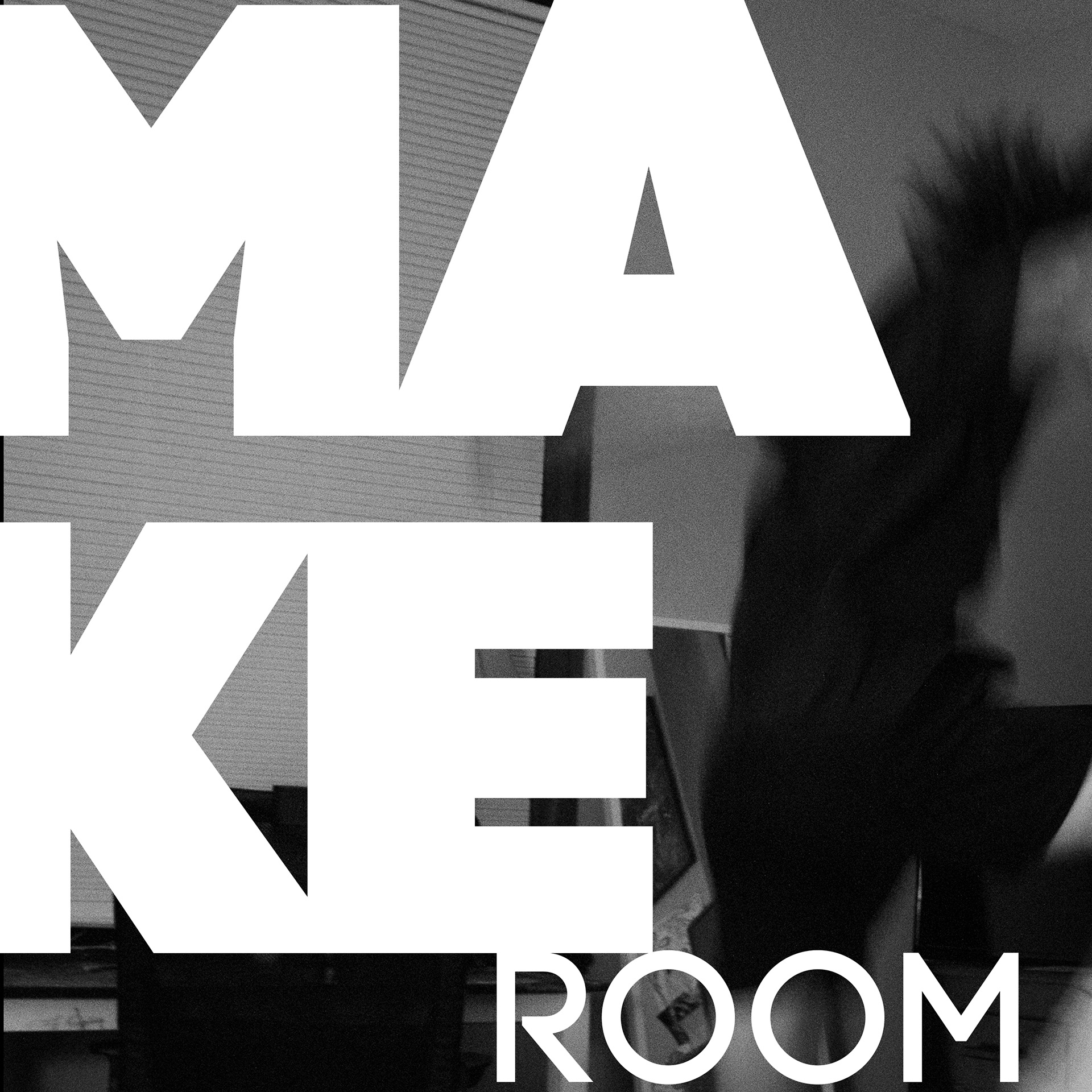
Here are some of the photos that I captured during this photoshoot.
I started experimenting with type on the cover and I thought that keeping the theme of contrast within the title and the artist typography would strengthen the aesthetic while still preserving the motion of the subject and the feeling of the image.
Final Design
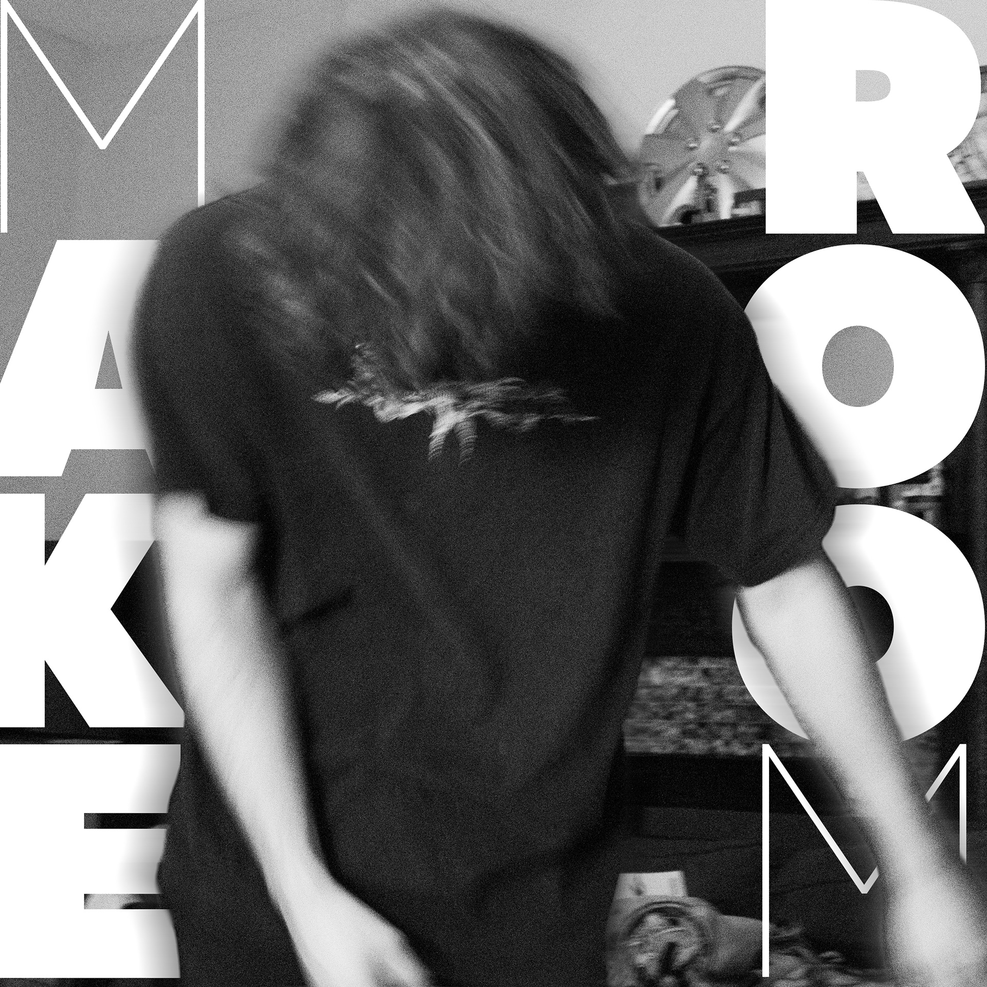
For the final front and back cover designs I decided to go with a close up and more detailed shot of the subject's head in motion. The title and artist typography is minimal, yet contrasting in the weight while still keeping the image a prominent focal point of the design. The back cover typography of the song titles represents the motion of dancing and the feeling that the songs in the album portray.
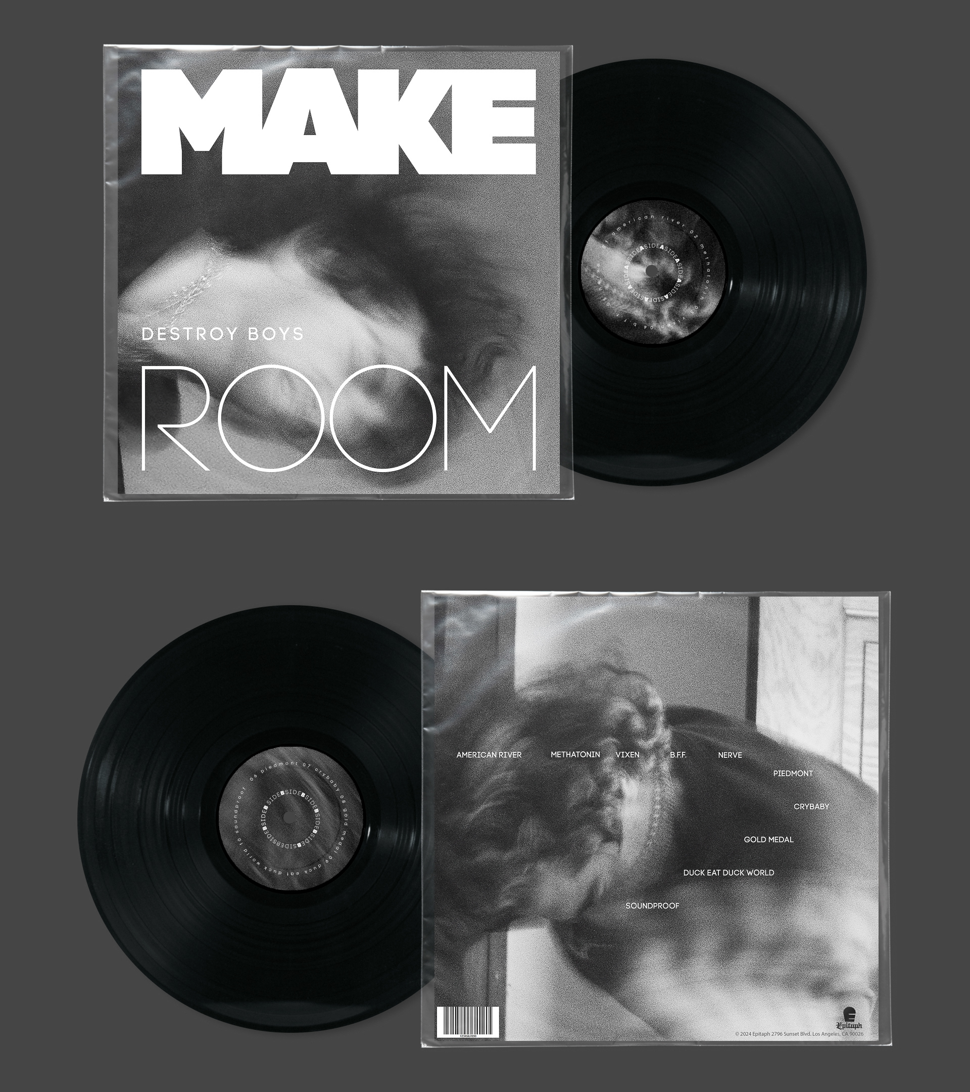
The side A and side B vinyl stickers are an even closer shot of details in these photographs that keep the grungy texture and further the raw themes of the LP. The typography in the stickers mirrors the cover typography with contrasting weights and follow the circular motion of the sticker for continuity.
The spine has a gradient that reflects the black and white grainy aesthetic of the images in order to tie the front and back cover together effectively.
Final Mockup
The final product of the album was a fully hand built mockup that I created using a thin cardboard material and folding it to create the shell of the album sleeve. I then glued the covers onto this shell and placed the stickers on the front and back of the vinyl.
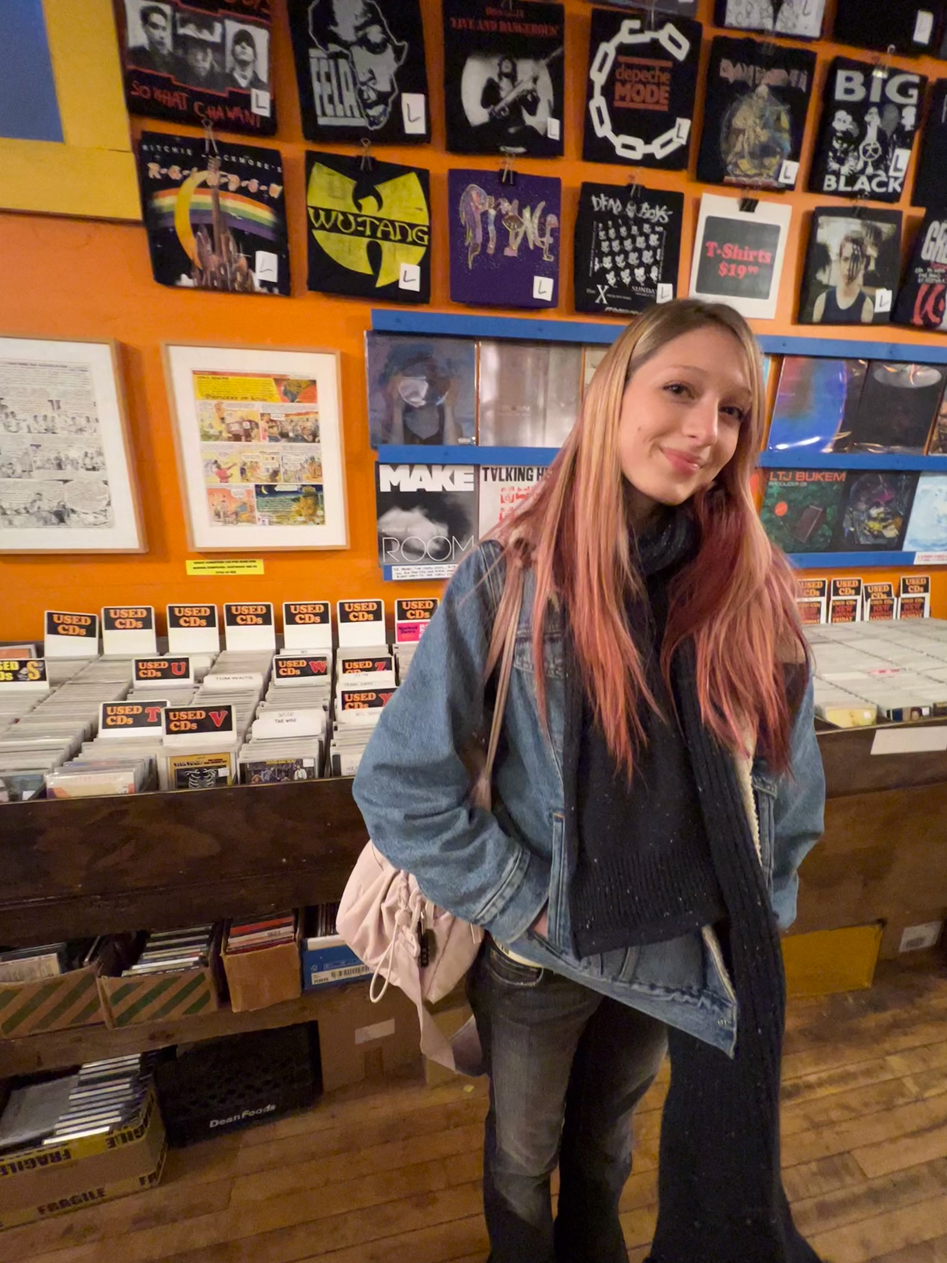
My professor as well as the owners of a local record shop called Shake It Records hand select the most successful album creations from the semester to be displayed at the record store. My LP was one of the albums that was selected.